

📙 #056 - How to tell when your art is bad
But also, how to tell when it's good. A quick rule of thumb.

Here’s a quick rule of thumb that was taught to me, so now I’m going to teach it to you. Obviously there are exceptions to this, and by saying someone else taught me I’m neatly sidestepping any responsibility. Here it is…
Good (print) art has to pass these three tests;
The across the room test.
The 2-meters away test.
The up-close test.
If the art is interesting and engaging at all three distances then it has potential to be good art (we’ll cover “interesting” and “engaging” in a moment).
The flip of that is, if it fails at any of those three then it’s not good art, it can be good, excellent even, something else (i.e. graphic design, poster design) but not good art, sorry, I didn’t make the rule.
The reason for telling you all this is two fold; last week I made some bad art, which I cut up into postcards, but I still want to share the results with you, so this is my “hook” to hang that off.
The second is pen plotting, which a lot of you here are all about; because it has the super power of almost always passing the 2-meter and up-close tests due to the novelty factor and weirdly algorithmic ink on paper look, which means you only have to solve the across the room part.
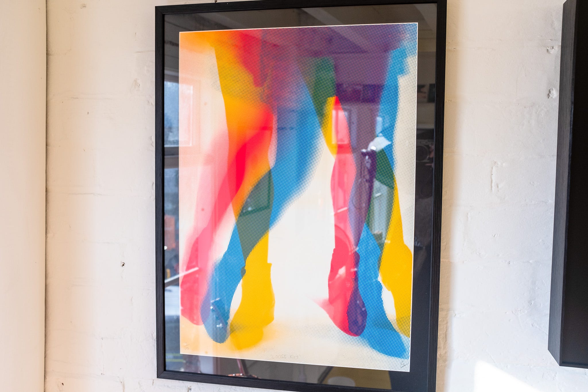
# GOOD ART EXAMPLE
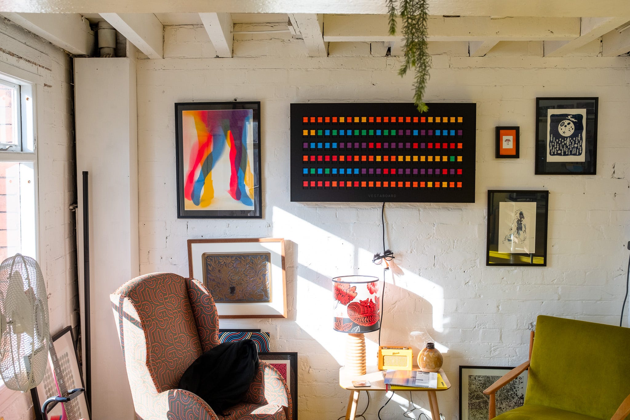
Over on the left, those legs is 'Loose Fit' by 'Sonofafox' (Brian Giles): https://www.instagram.com/sonofafoxx/ viewed from across the room (kinda) with a 35mm lens, which is roughly what your eyes are if you throw away the danger-spotting peripheral vision.
From this distance the print is both “interesting” and “engaging” in that there are obvious shapes but you have to look a little longer to figure out just what’s going on.
As you get closer…
…you get a little “wait-a-minute, there’s something else going on here” texture! The overlapping works because there’s some halftone shit going on, awesome.
So, we step a little closer and engage with the print…
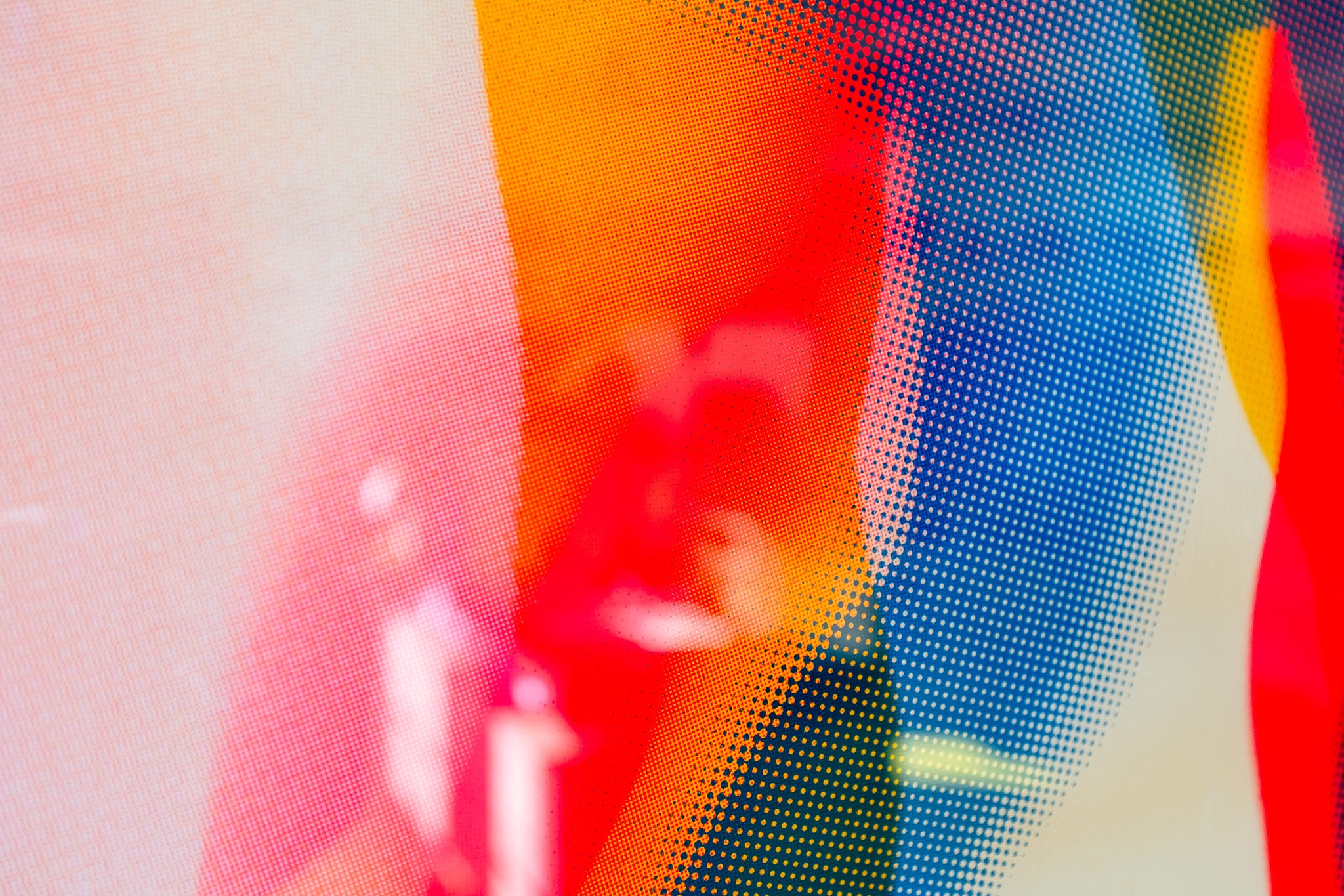
…we can see that there’s three different scales of halftone going on, clearly the artist has made an intentional decisions.
Therefor: good art.
See, it’s simple.
Or a different way around, it may or may not be to your tastes, but because it works at three distances it’s NOT bad art.
# GOOD POSTER DESIGN
Here is what’s hopefully a working three image gallery, but who knows what substack will do…


…a typographical poster.
USE WORDS
NOT TOO MANY
MOSTLY SHORT
Good advice, works from across the room, but you don’t really get anything new out of it when you get to around two meters. However, when you get even closer you’re rewards with some nice texture. So, passes two out of three.
Which means I’m going to controversially say, this is not good art, but it is fantastic poster design. Which is exactly what it’s trying to be, so ultimately it goes on the wall 😁
Here’s one of mine…


…which is intentionally graphic design and not art. It’s pretty solid from across the room, bold shapes, not too obvious, strong colours.
But, you don’t really gain much when you get two meters or properly close up. In fact we rely on the trick of having nicely textured paper to add close up interest.
# BAD ART, PEN PLOTTING SUPER POWER
Mean while, this is BAD ART…
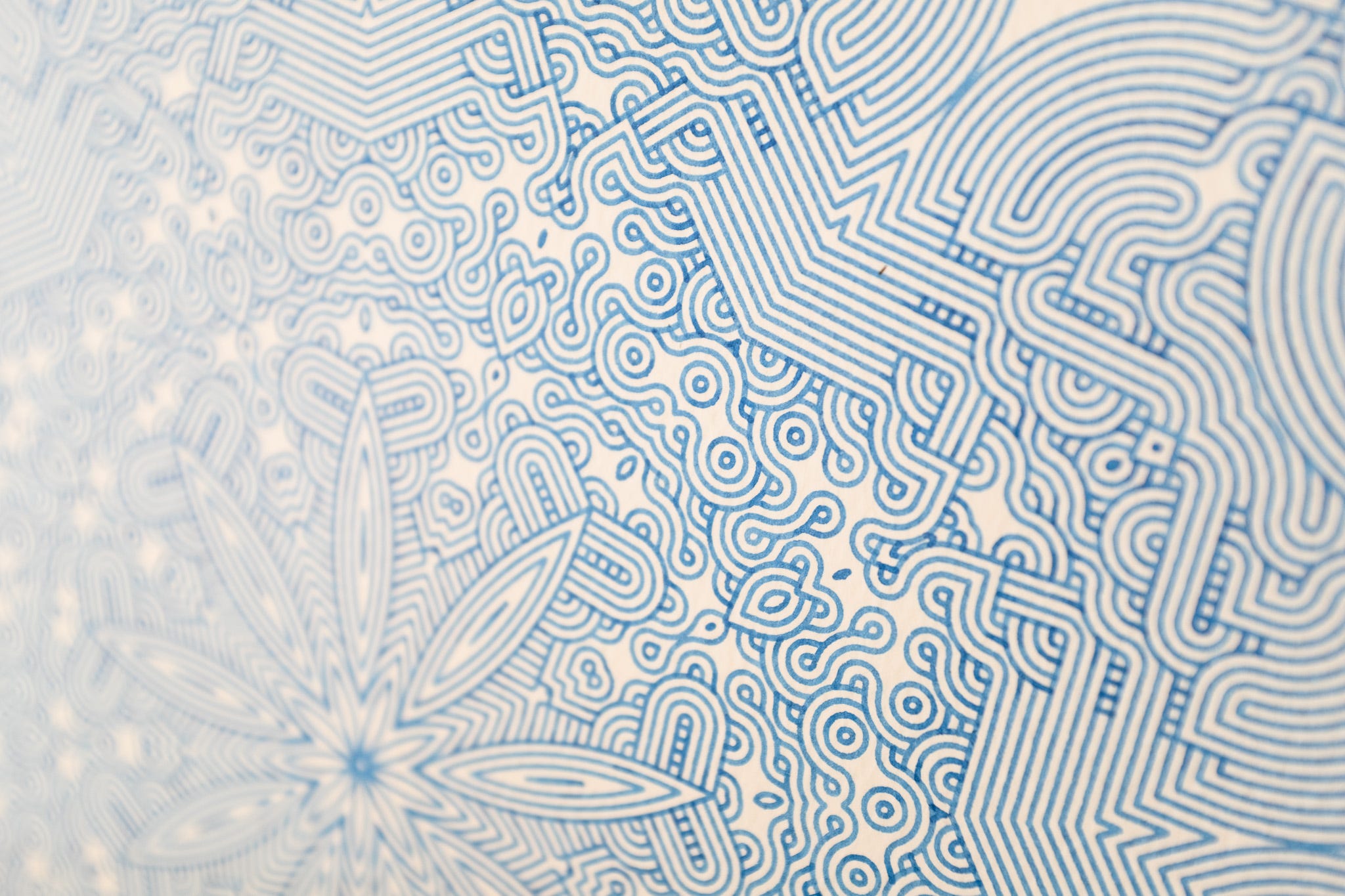
…your brain goes “Oh right, a star I guess” and I absolutely guarantee your eyes are finding pretty much every other inch of that image far more interesting than whatever is in the middle, they’re darting to everywhere but that design. The middle is almost the opposite of interesting and engaging (no matter how clever the code behind it is).
However, the two meter and close up tests it passes with flying colours and starts to get more interesting due to a) the intricacies of design and b) the delight of ink on textured paper.
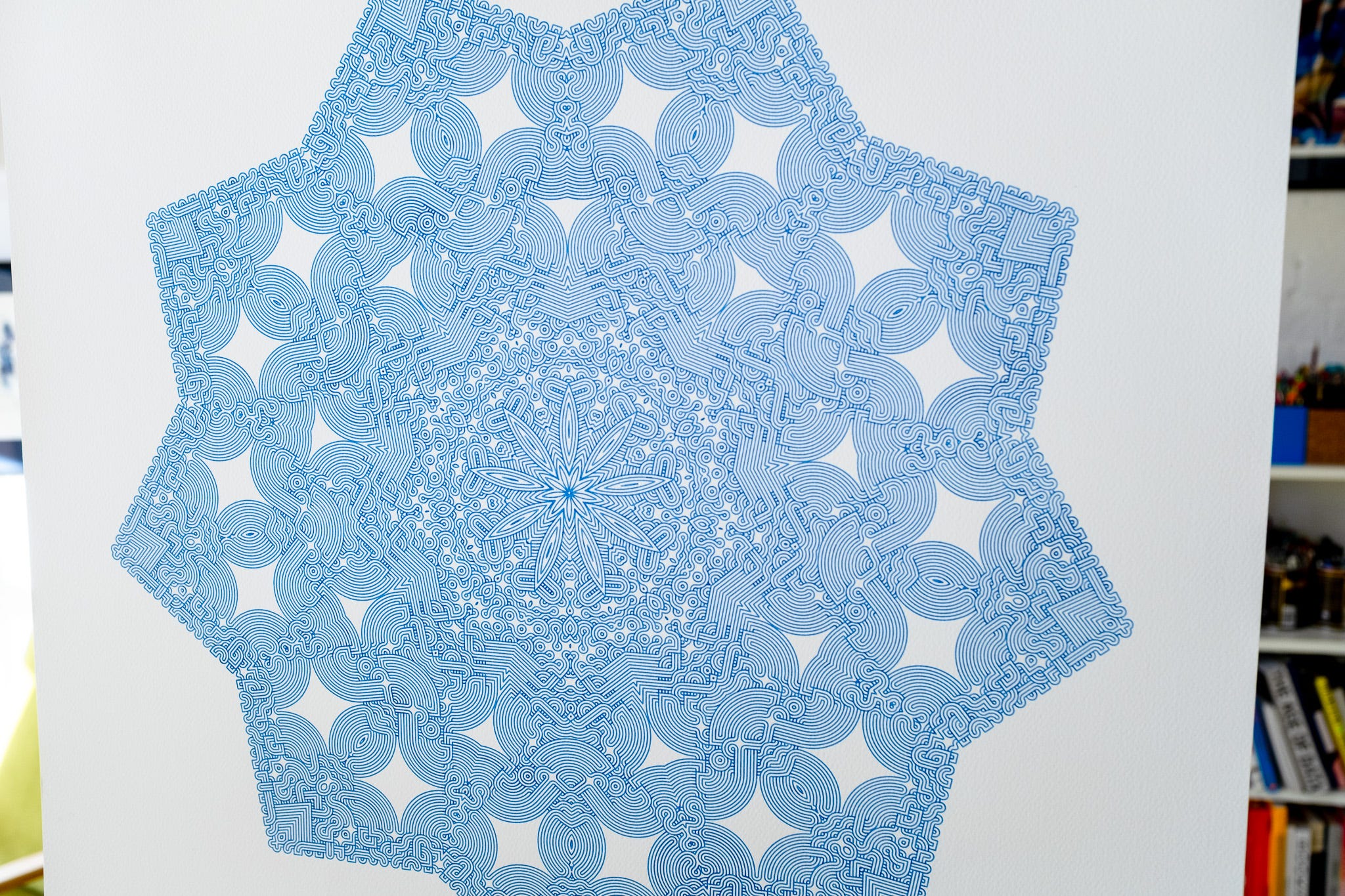
The “super power” of pen plotting is that you generally don’t need to worry about the second two rules, if you nail the first one, which you can often do by avoiding symmetry and repetition, then you’ve got a candidate for the title of “good art”.
# RECONTEXTUALISING BAD ART, THE STAMPING VERSION
So much for SHORT WORDS & NOT TOO MANY.
If you read last weeks newsletter, or seen the two most recent #Weeknotes videos, you’ll know I’ve been playing with using the new ArtFrame drawing machine as a rubber stamping device. And because I wanted to quickly test something that wasn’t totally “stamps on a grid” I threw a flow-field/noise-field at it as a quick first step to making things slightly more interesting. But in this case not interesting enough because it fails both the across the room and two meters away vibe check.
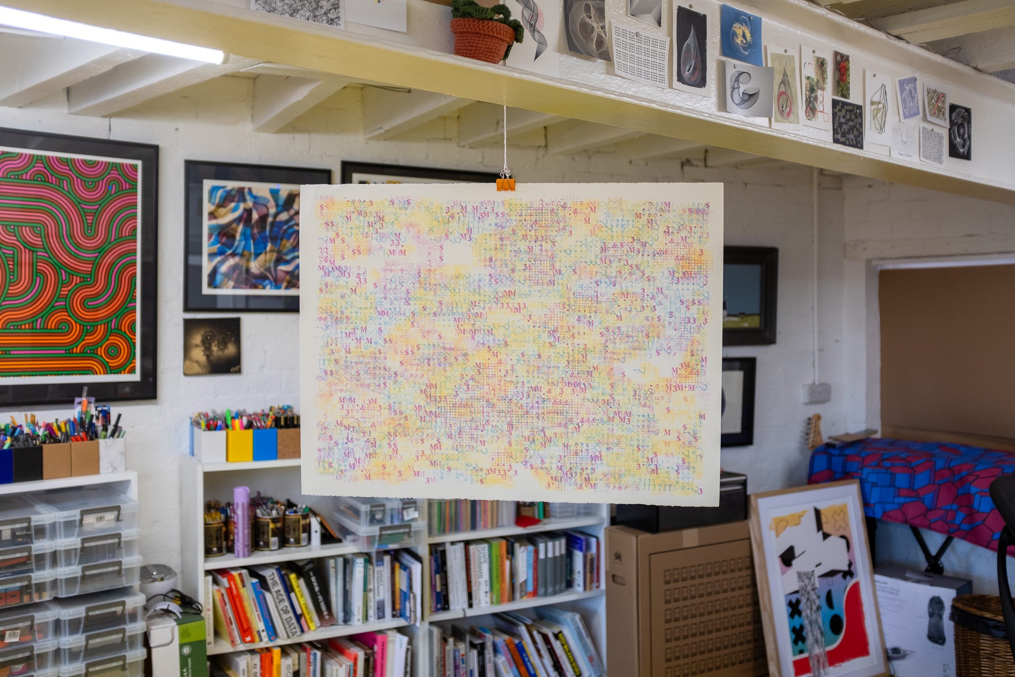
However, up close things suddenly get a little different…
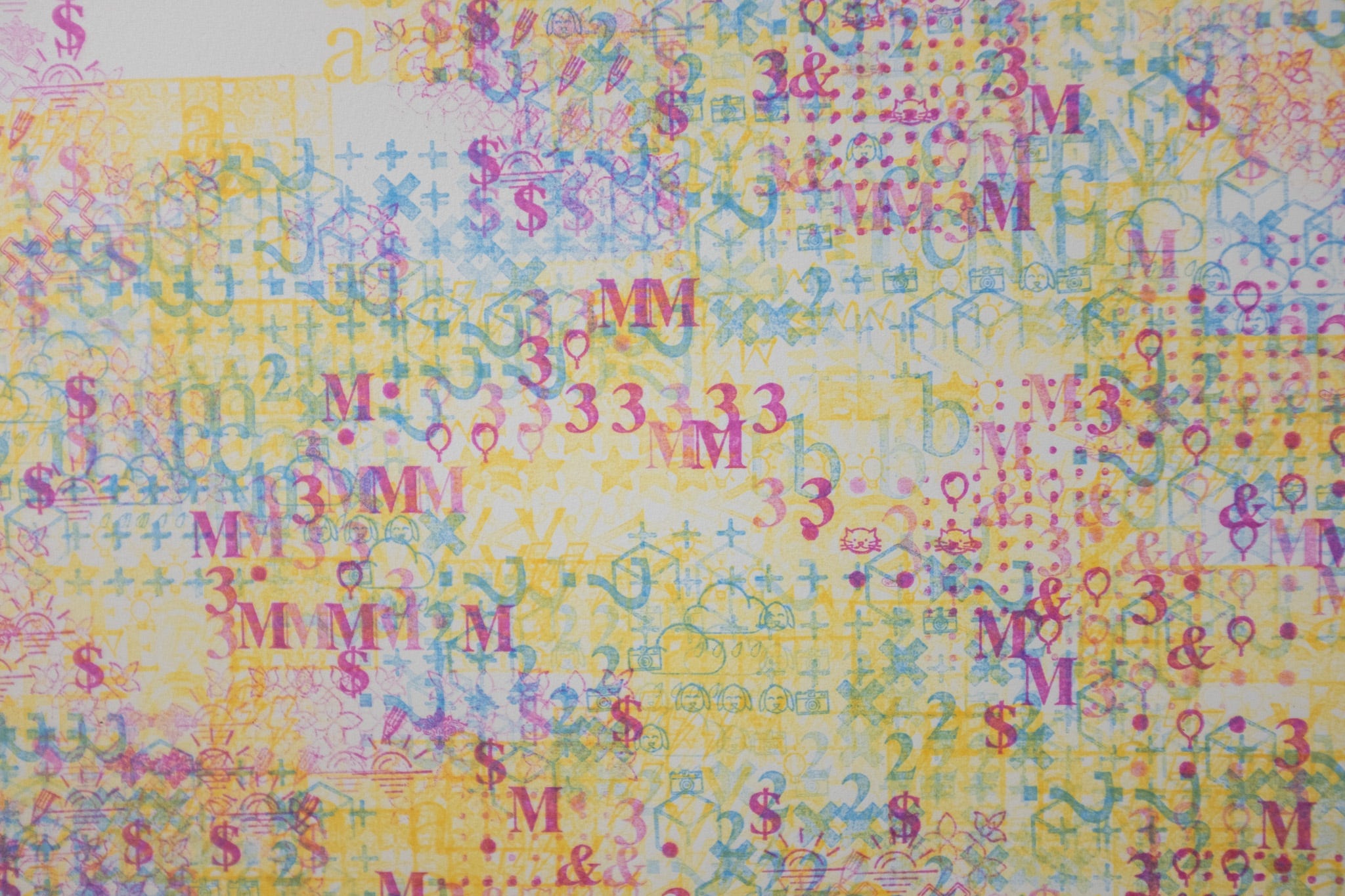
Now that closer we can see there’s different colours, shapes, sizes and so on.
Well, actually I think it’s just those three things, but anyway, the point being that it looks kinda cool close up. And we can force that by cutting the whole thing up into postcards. Which I think I wrote about in a past newsletter but can’t find now, so maybe it was a YouTube video or Instagram 🤷♂️
Regardless, after a little bit of searching and then remembering that I put a tool for drawing postcard sized cut marks on larger sheets of paper on fxhash: https://www.fxhash.xyz/generative/slug/gnrtr-card-cutting-marks-v2/explore-params, I did just that and everything is instantly better.
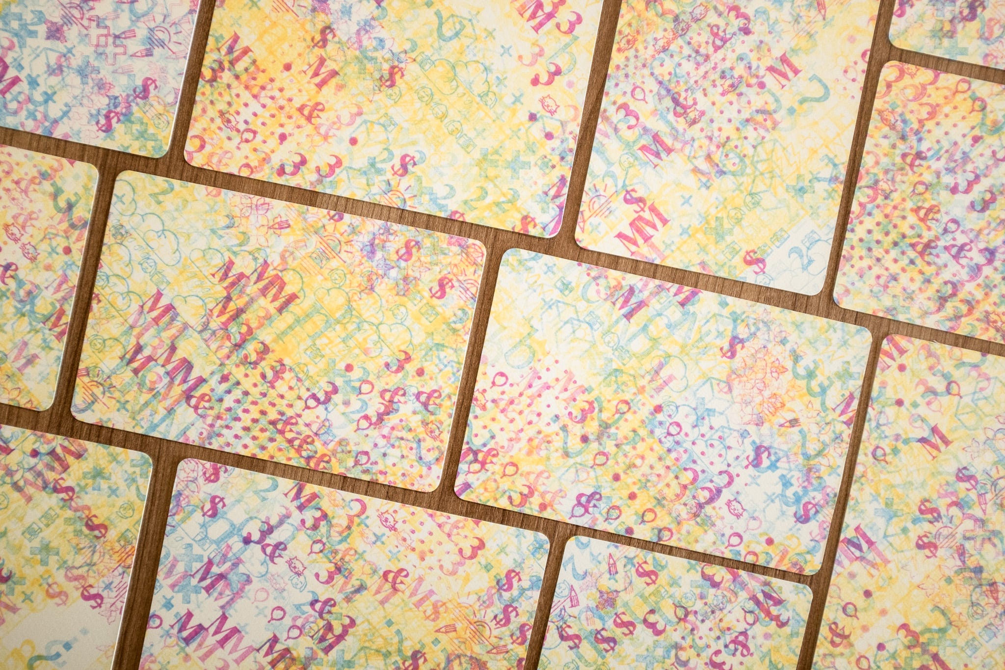
We’re causing the viewer to see the design close up, because tbh it’s really fricking hard to see details on a postcard from two meters away, let along across the room.
Doing this is the perfect trick for pen plotting too, which as we’ve previously covered generally looks great close up. And due to the nature of plotting being difficult to go right up to the very edges of the paper (‘cause if you go over the edge even slightly there’s a good chance your pen will trash the paper); by cutting a larger design down into smaller pieces you can now go “full bleed” to the edges.
If you want to make a cool looking postcard I highly recommend plotting on an A4 sheet of paper and then cutting two postcards out of it, I promise it’s worth the effort!
Hopefully, the three rules will help you as much as it helps me.
‘cause I make bad art all the time, and sometimes when I’m not sure if something is good or bad I just stand on the opposite side of the room and can instantly see that what I’ve done is indeed boring, and therefor bad 😁
# THE END
I was going to mention a cool thing with a 3d printer, but substack is once again telling me this email is near the length limit. I wonder why it’s always doing that?
Perhaps I’ll save that for next time, along with the oil pastels experiment! Which I guess will turn up on the 20th of March, 2025
Catch you then and love you all!
Dan
❤️
Substack often complains to me about posts being too long and I just keep writing and send them anyway! I think it doesn't actually cut anything off, just sometimes it has people click through to the site to read the rest.