

📙 #068 - THINKING IN BLACK & WHITE (AND GREYSCALE)
Writing art code for riso printing.

# HOUSEKEEPING
I’m down in London this week getting a Flickr based project ready to launch, more on that some other time though. Last newsletter I floated the idea of getting Kitty my AI PA to write this one as I was going to be ridiculously busy, but as someone wise once wrote about AI writing…
“If you couldn’t be bothered to write it, why should I be bothered to read it”
…which I totally agree with!
Instead, an actual mercifully short photo based one this week.
# CODING CODE BASED ART FOR A RISO PRINTER
Quick recap, a riso printer is kinda like a cross between screen printing and a photocopier. If you wanted to screen print something (like a t-shirt) using three colours, you’d make a screen for each colour, and then force paint through those screens, pretty standard.
The riso printer is basically that, but the screens are wrapped around ink drums in a machine that looks and works like a photocopier. It’s cheaper and faster than screen printing, (but you’re limited to the ink colours you have) and slightly more fiddly and more effort to use and maintain.
The FUN part is that the inks are kinda semi-opaque (or semi-transparent if you’d prefer), sometime fluorescent, and you have to think in “opacities”, i.e. mixing 40% yellow + 40% fluorescent pink gets you a dark, but bright funky orange colour.
Here’s Kelly once again on YouTube if you want to see all of the above in practice, in a nice chill colourful video…
…so, what happens if you just so happen to be a generative/code/algorithm based artist, who write code to create lovely images, and wants to send those to a riso printer? How do you separate out the colours to send them to print?
Well, thankfully you can use spectrolite app: https://spectrolite.app/ which does that colour separation for you, here’s a screenshot…
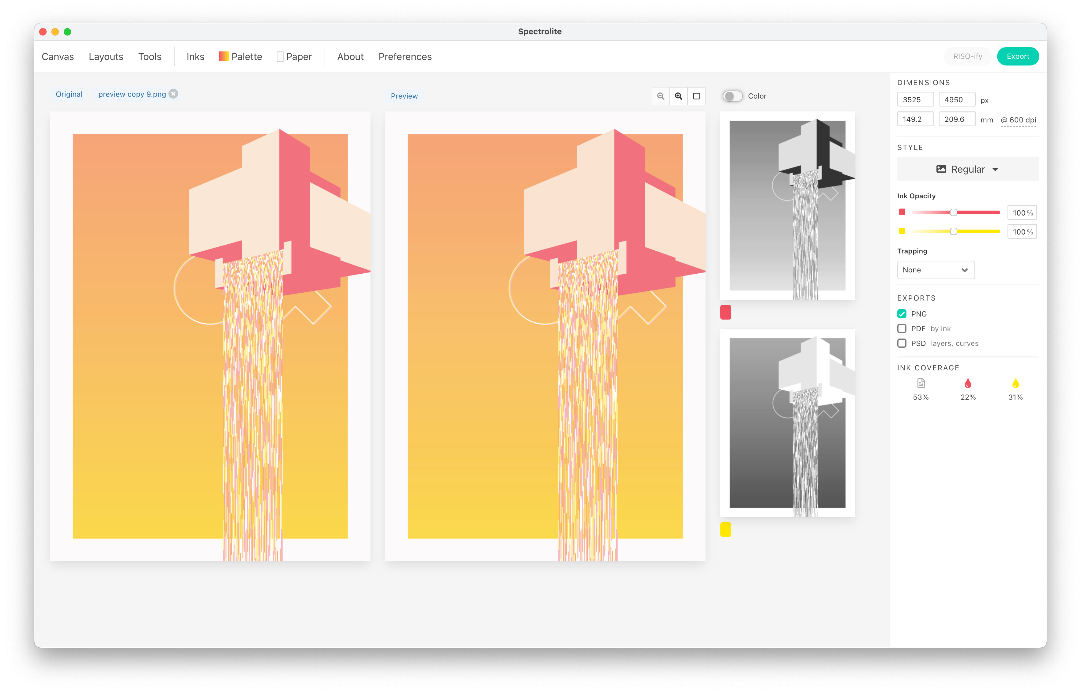
…the left most image is the original full colour image I dropped in. The right colourful image is a preview of what the app thinks it’ll look like. Over on the very right is the greyscale separations, one for red, one for yellow.
Feed an image in, get the files you need to send to the riso printer back out. The cool thing about spectrolite is you can tell it which inks you own and then only use those colours when splitting the image up.
However in my great wisdom I thought, “Hey, wouldn’t it be better if, instead of my code spitting out a final design and then using spectrolite, I instead had an empty greyscale canvas for each ink colour, and used code to draw to them separately! Then I can send those directly to the riso printer, and also combine them to get a preview?”
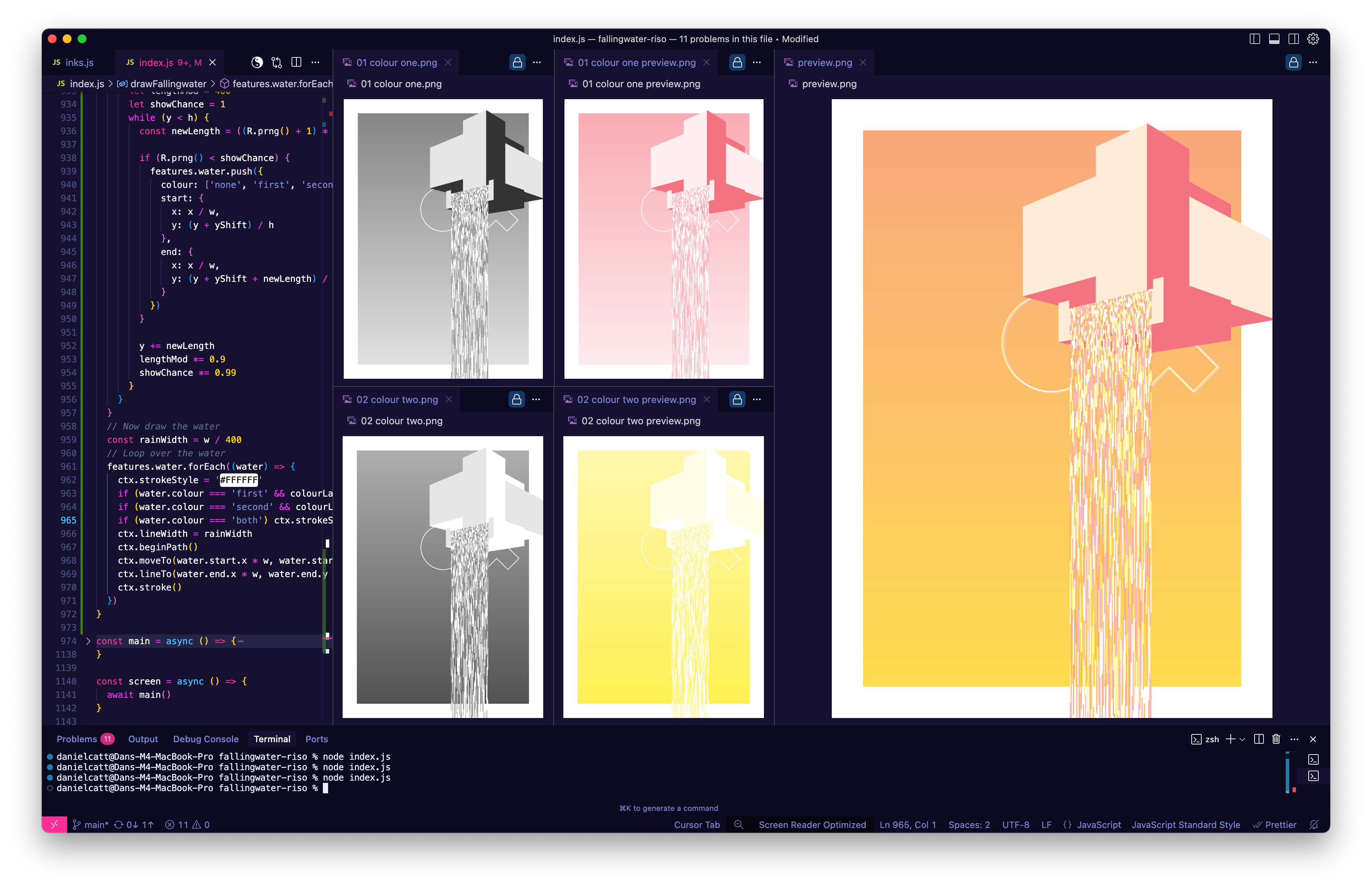
Above we have; code on the very left. The two greyscale canvas objects I’m writing directly to, then both of those coloured with the ink colours I have (randomly selected), and then finally a preview on the right of what they look like blended together.
Which is the preview I fed into spectrolite above to see how it’s separation compared to my original grey scales images.
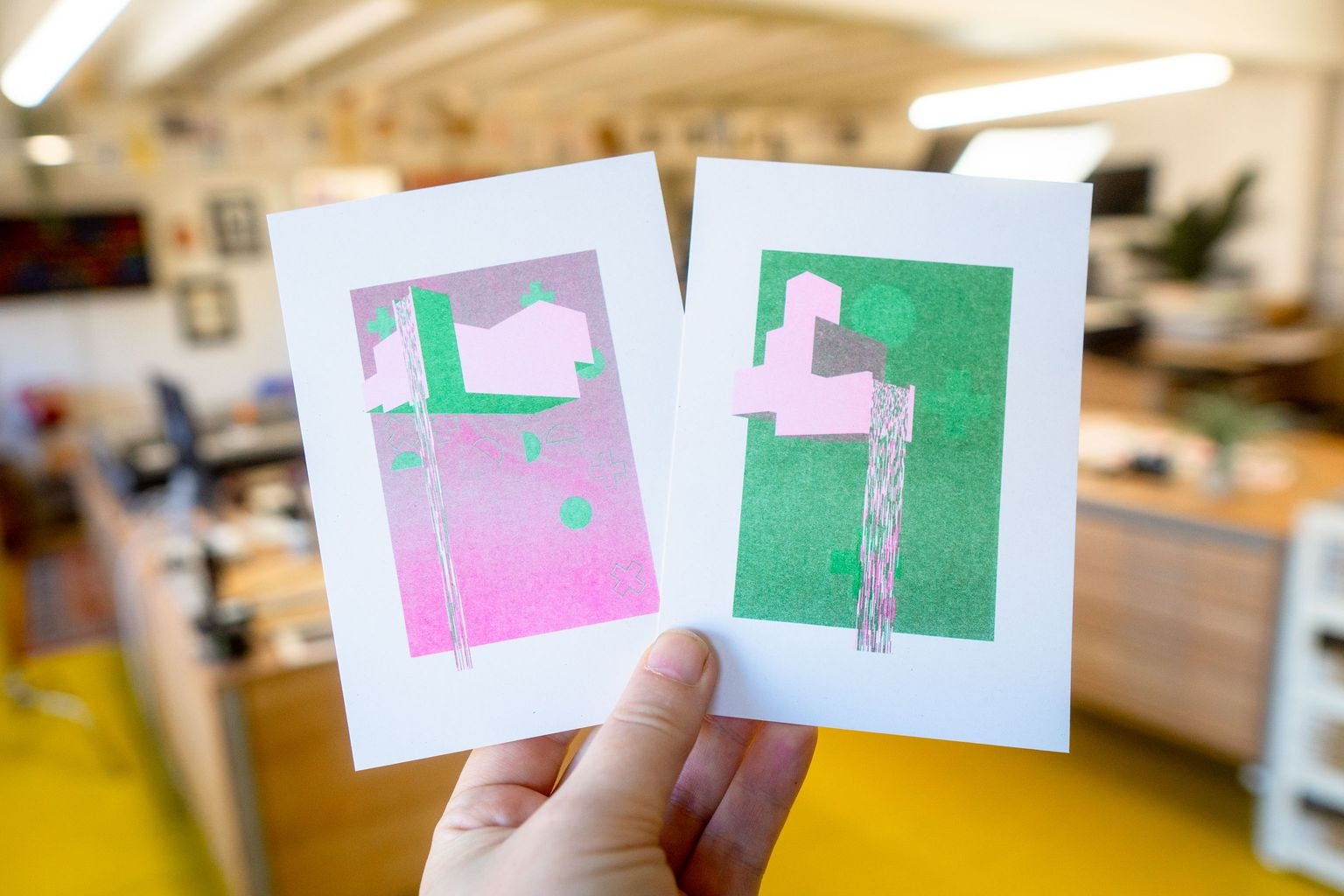
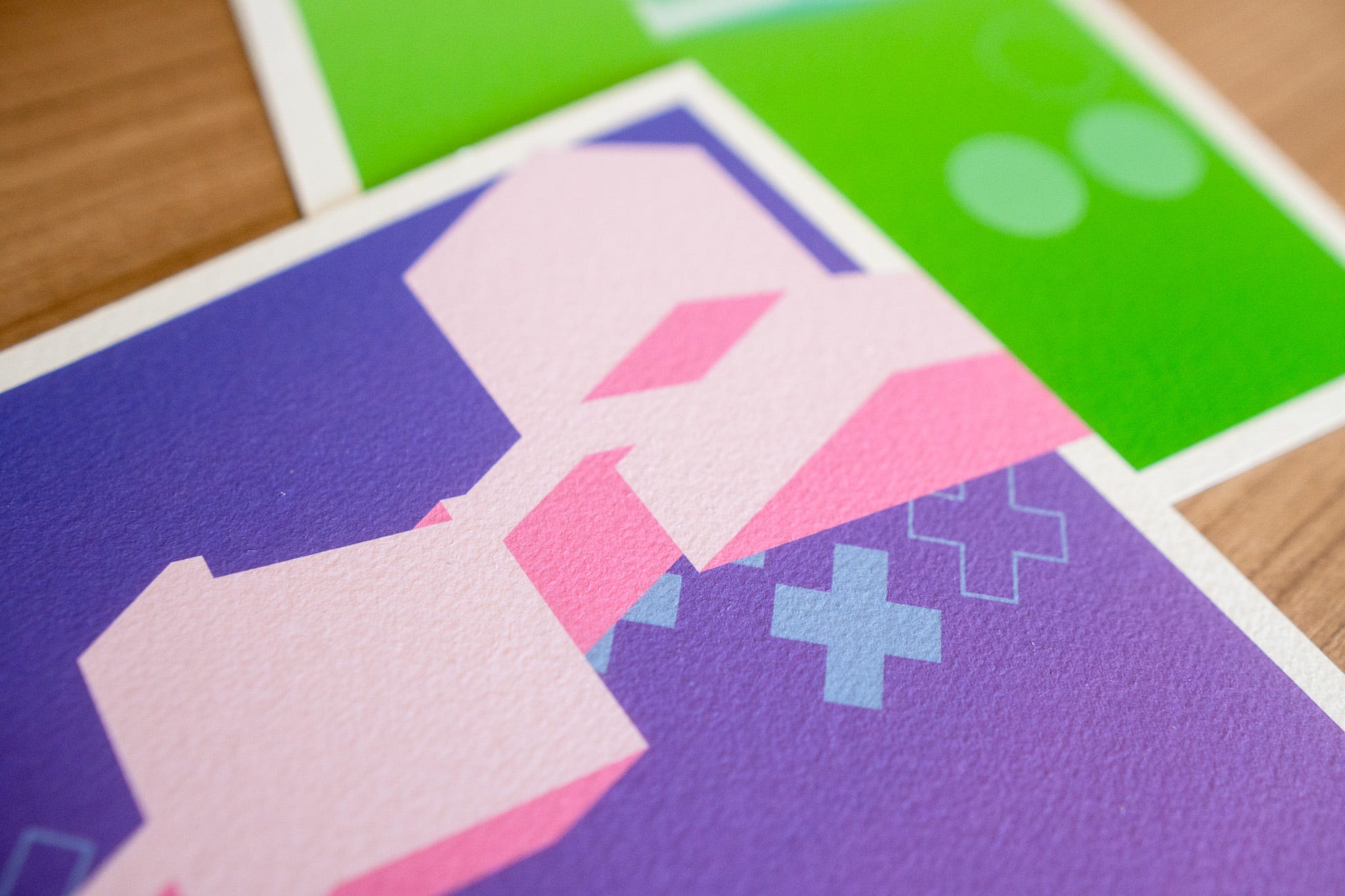
Here’s nine more preview outputs, each one is made up of only two colours blended together.
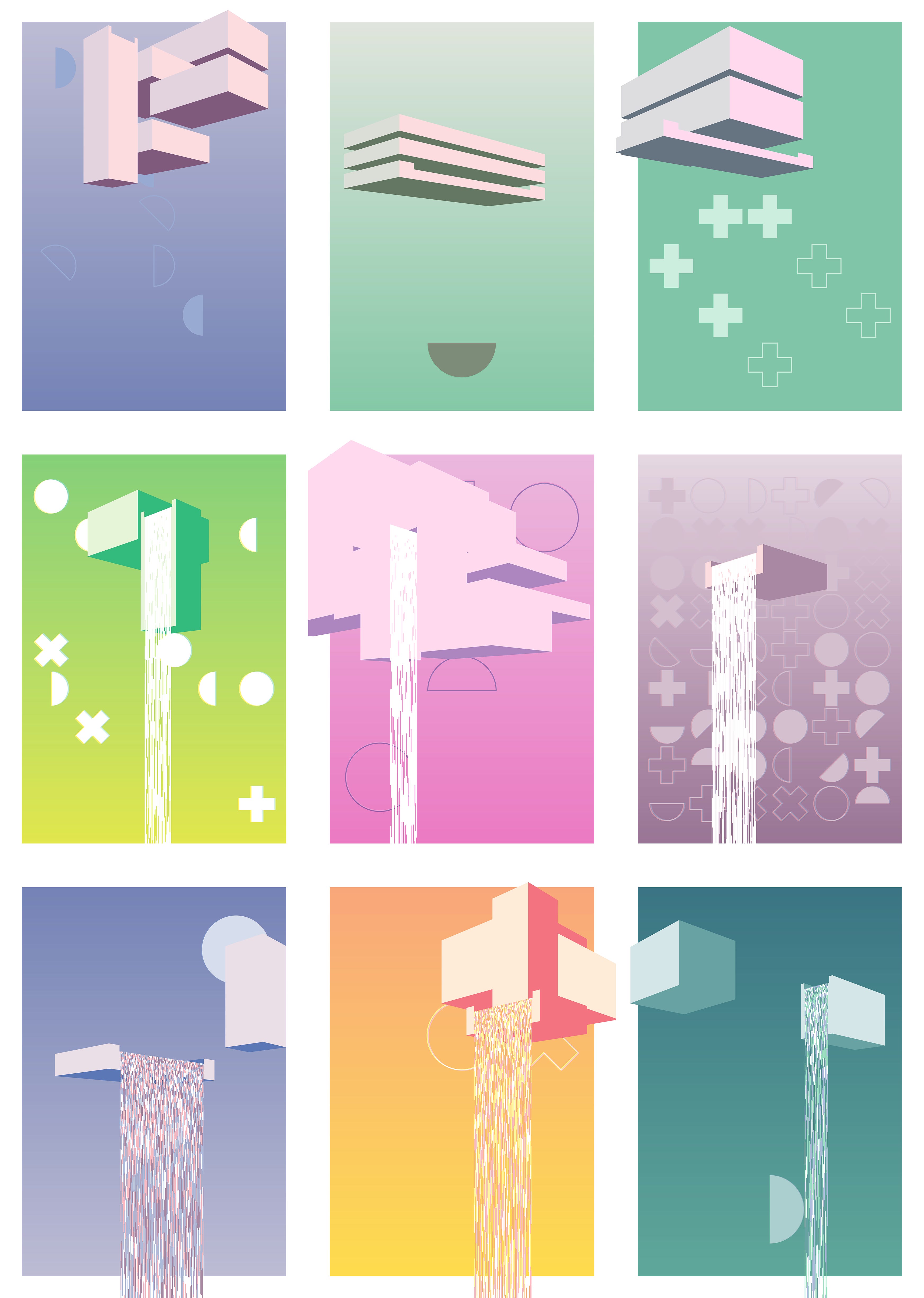
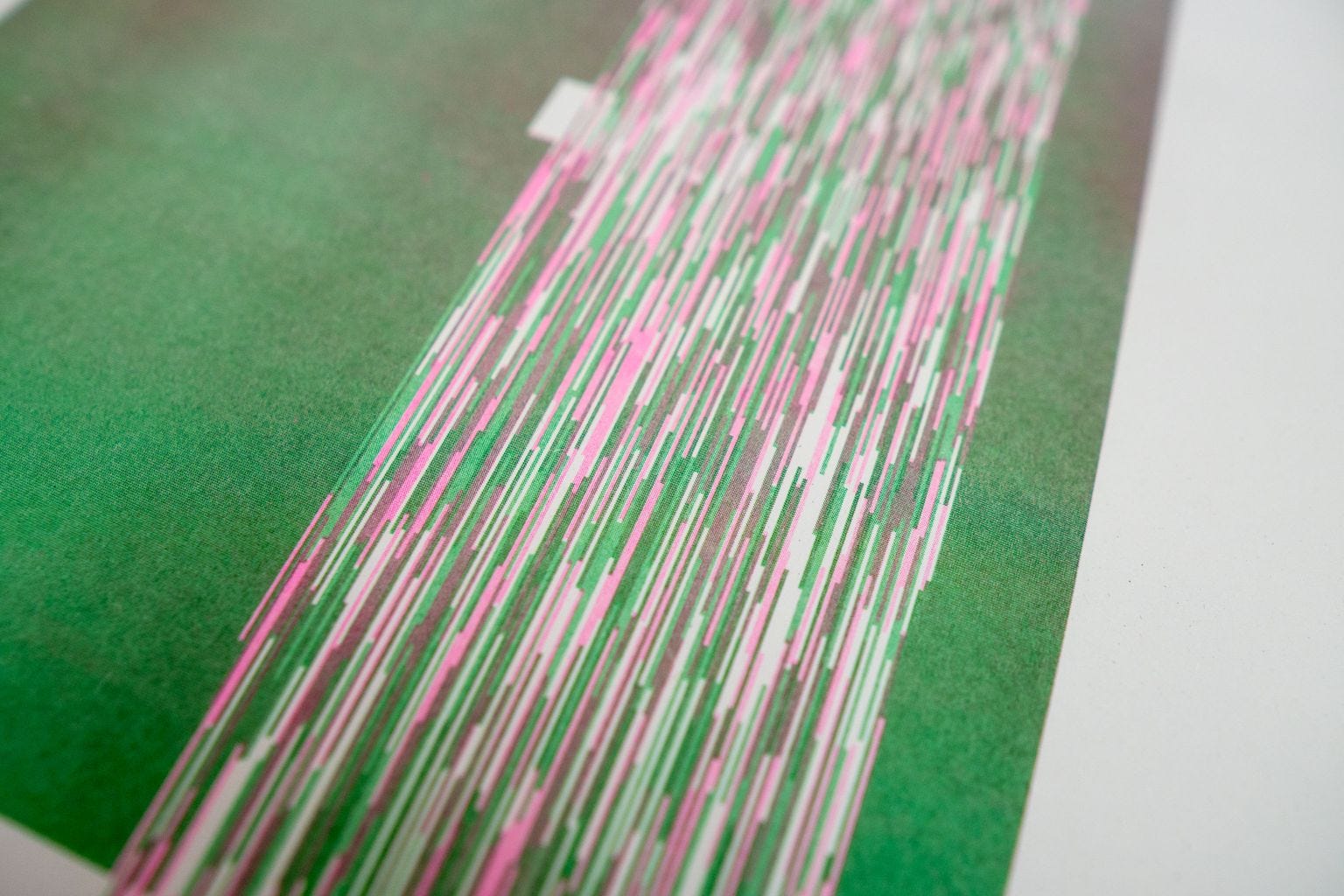
The top three are before I added the actual falling water to FALLiNGWATER. The middle three are before I added the colour code to the water, it’s just the white silhouette of the water. The last row is with the colour added.
Because I’m tired and it’s late I’m going to cut right to the part that I think is the interesting/fun bit, and perhaps you will too.
With riso printing we’re thinking in opacities. To make the sides of the floating blocks light-ish we’re “punching out” the background with white first, and then drawing in 20% grey on one of the canvases, to give us 20% opacity in whichever colour.
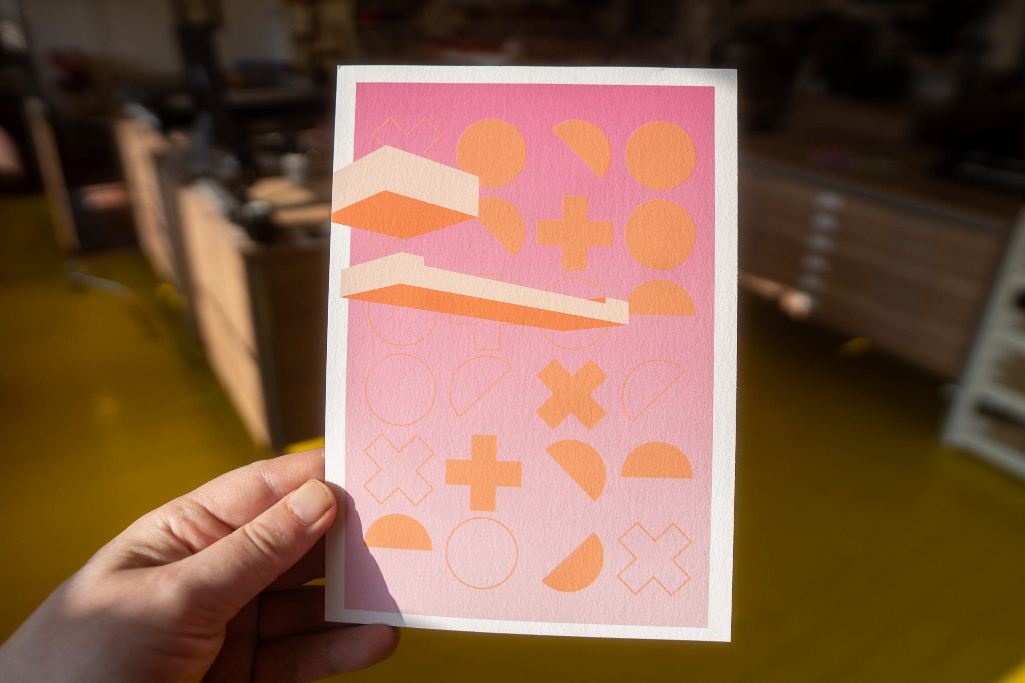
To make the bottom of the blocks dark, we’re aiming for 80% opacity, taking the middle image as an example, which is blue & pink, we can use 80% blue, or 80% pink, or 40% blue + 40% pink.
Or to get different shades between whichever two colours you’ve chosen you could also do 10% + 70%, 20% + 60%, 30% + 50% and so on, any combination that adds up to 80%
# KEEP IT SIMPLE STUPID
It’s at this point I’d like to say something about how writing the greyscale images directly, rather than using spectrolite is somehow better; that it gives you more control.
That juggling two (or more) canvas objects instead of just one, and then drawing design elements to one, the other, or both, in various opacities, while keeping track of which parts to punch out, or mask out, means the end result is better than giving over control to something that’s “simply” just separating them out.
But I suspect that’s not true, or if it is true, the advantage is marginal. If having full control gives me 100% perfect outputs, spectrolite (in this instance) is giving me about 97% perfect outputs. And considering how imperfect riso can be, that’ll be eaten up by the printing process anyway.
I’ve circled round “why generating the greyscale images directly in code is better, actually” - and the best I can come up with is…
…it’s an interesting exercise in coding and thinking about colour mixes.
In every other way it’s harder, more time consuming and, honestly, irritating, than throwing it into spectrolite. I guess the main plus side is that I can quickly switch out and swap the ink colours in the preview 🤷♂️
# PREVIEW
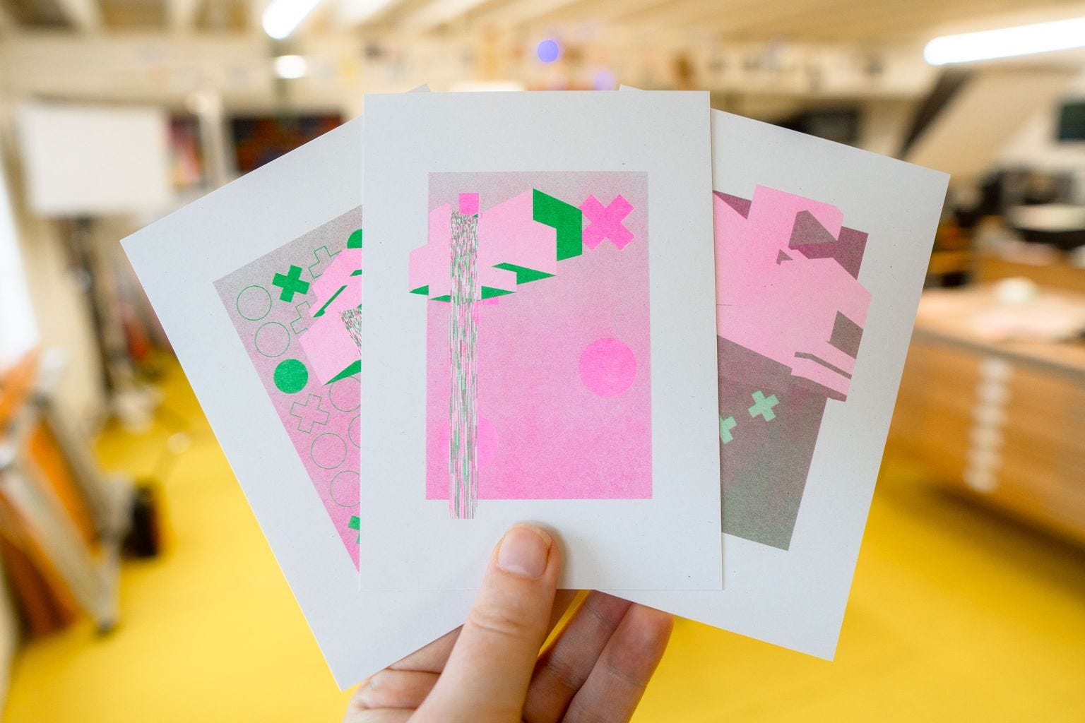
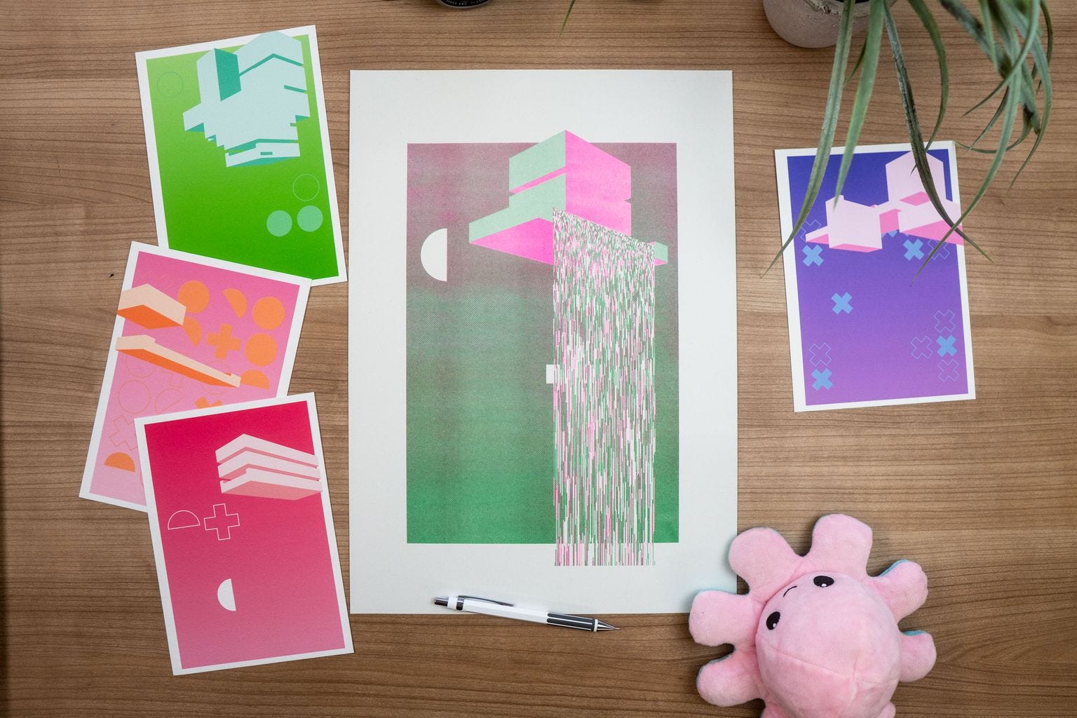
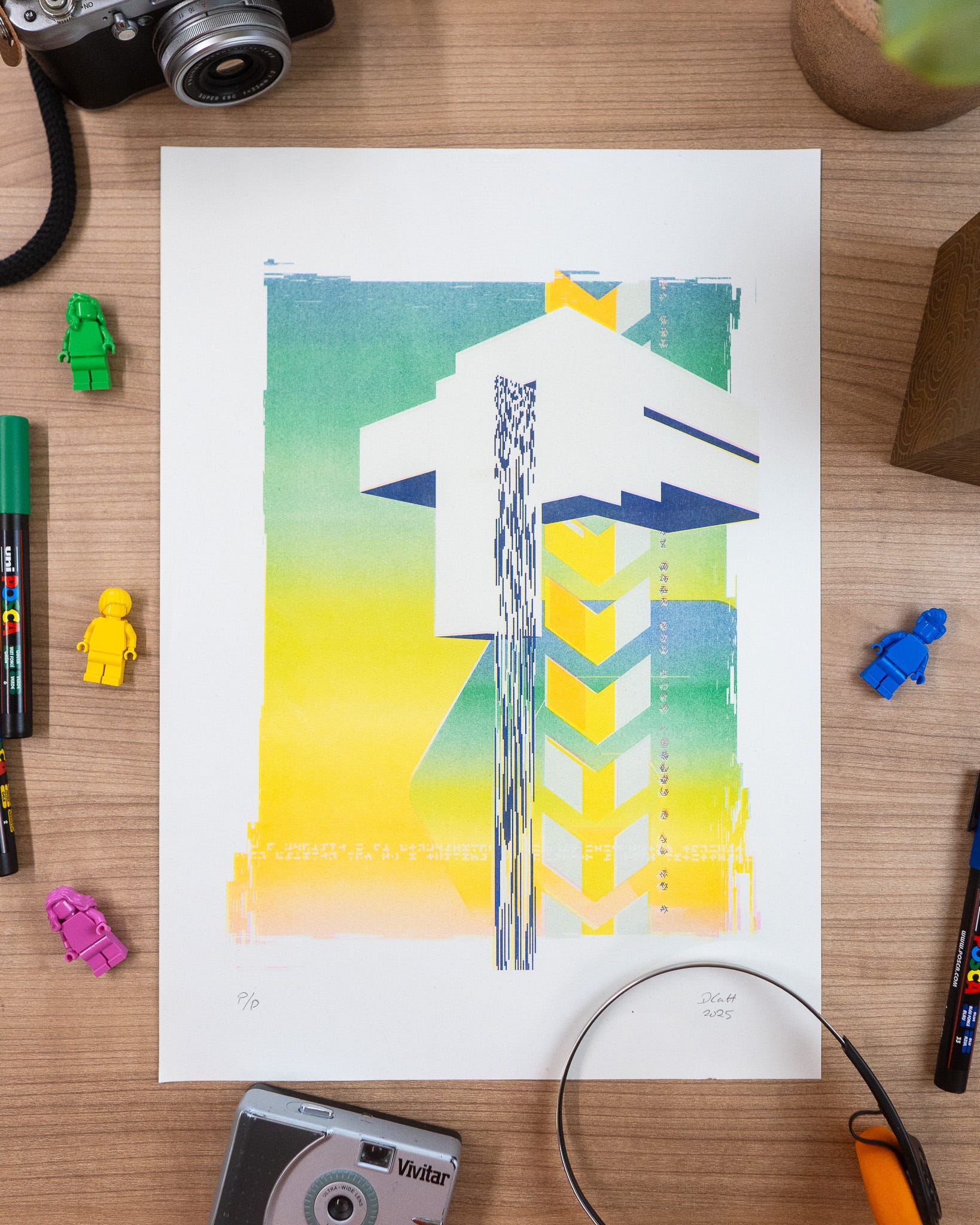
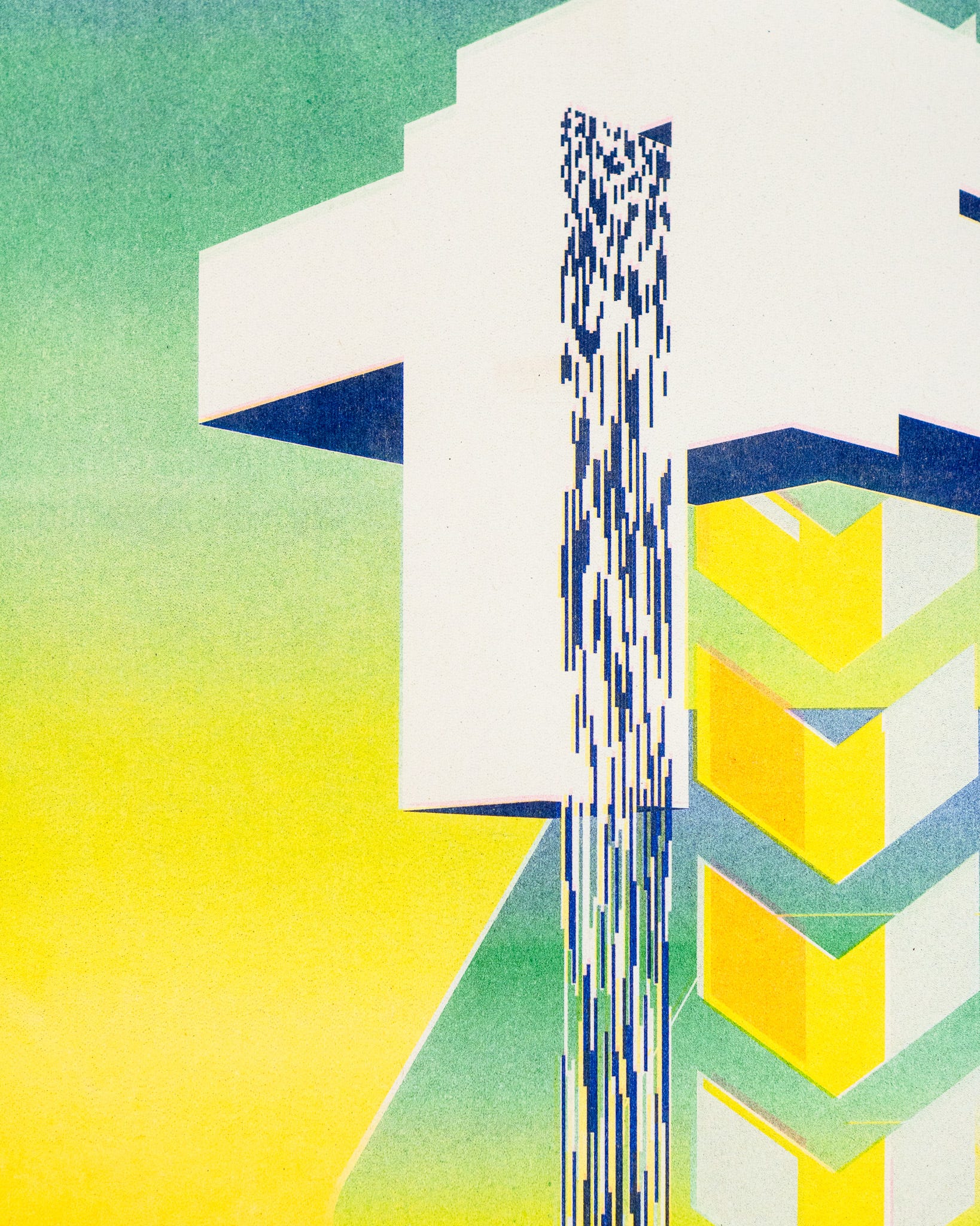
Before sending anything off to the riso printer I also printed some of the earlier previews on the Epson SC P900 to get a feel for it…
Which leaves me in the weird position of aiming towards the end result being generative, unique (or very limited), riso prints, but really liking the work in progress test prints that don’t even have the falling water in.
Annoying!
And to really drive the point home, here’s a four colour separation done in spectrolite, from an original FALLiNGWATER.
# THE END
I think what I’m trying to say is, I’m glad I’ve been exploring ways to code for riso, but I guess sometime you don’t always come out ahead no matter the amount of effort you put in. Will I continue? Yes, because I’ve now built the tools. Would I have just been better off using spectrolite in the first place and spending my somewhat limited time differently? Also yes! 😅
According to my records, the next newsletter should be out on the 4th of September, by which time I really hope things are a bit more chilled and laid back for me. I’d say the last six weeks have been pretty full on, and I’m ready to get back into art-ing (and tutorial video making-ing) again.
Oh, one day these riso prints (and normal prints) will be in my shop, but that’s looking like a 2026 thing now, uhoh!
Love you all,
Dan
❤️
For those who enjoy vlogs, making things, music, creativity, or feel stuck and can’t get started, ‘cause things keep getting in the way, from Laura Kidd 💌 Penfriend …
I honestly love this series... really like the one without the straight border — even the preview outputs look great!