

📙 #065 - Overly specific design and evolution.
A solution to stabbing oneself, an early new project, riso (again), will I get truncated, and OMG WHY IS IT SO HOT?!

I’m trying an experiment this issue; which is to not worry about the Substack “Post too long for email” thing. Each time I mention I’m wrapping up the newsletter because that message has popped up, I get some very kind messages (thank you all) letting me know that they themselves have gone over the limit before and nothing terrible has happened.
I tend to go over the limit ‘cause I include lots of photos (which often sends email to the spam folder anyway), and the help page says…
‘While there isn't a word count or length restriction on Substack posts, some email providers like Gmail will truncate messages exceeding 102KB
If the newsletter is truncated in an email, readers can click on “View entire message” and they'll be able to view the entire post in their email app’
And everything I’ve ever read about newsletters says that people just don’t do that.
Mind you all those things also say to capture the reader’s attention within the very first sentence, and I don’t really bother with that advice either, so perhaps nothing matters anyway.
# NOTEBOOKS, AGAIN
I made this ☝️ because I don’t like stabbing myself — what it is down below in a moment.
I’ve previously talked about making notebooks back in newsletters #062 and #063, and also the question “what happens when you can generate images faster than you can print them, and what does that mean for the printing process” in newsletter #059 for context.
This isn’t new of course, FIELD NOTES, purveyors of the worlds best pocket notebooks occasionally make notebooks where each cover is different due to some printing process or other. But one release that stands out are/were the snowflakes…

…99,999 notebooks all with a different generative snowflake on the cover created by artist and all round good egg Brendan Dawes, see also “Play-Doh as Interface” - to pick a semi-random digital/analogue project of his. If you haven’t explored Brendan’s work you really should, his website (and shop) are both a delight.
Anyone following my notes (which I’m assured by Substack are show to at least five people) will have seen these photos…
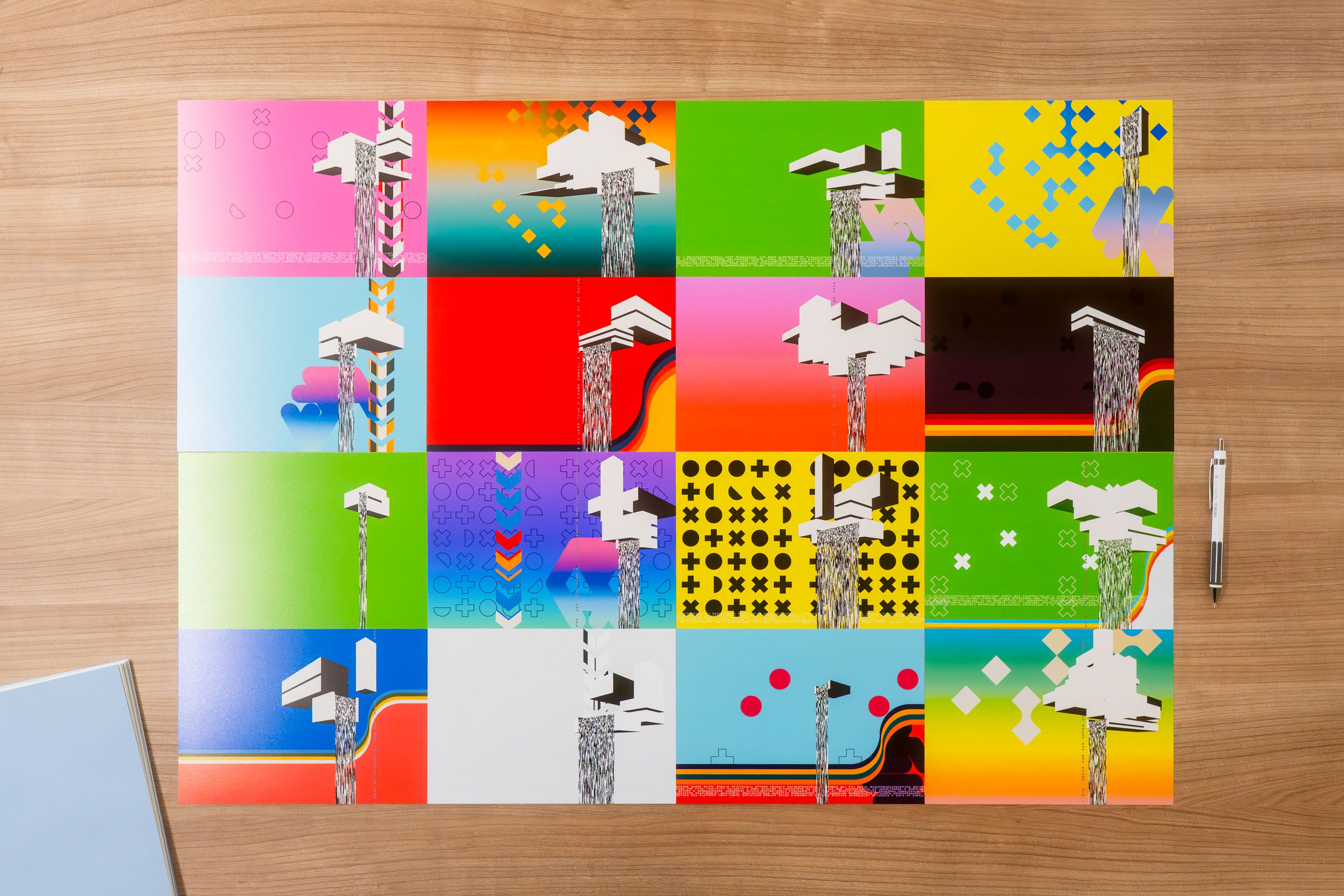
Where I’ve reconfigured the FALLiNGWATER code to extend what is normally a portrait design off to the left, moving some elements over, but keeping the main one (the floating builds) on the right, so when they’re folded into a cover…
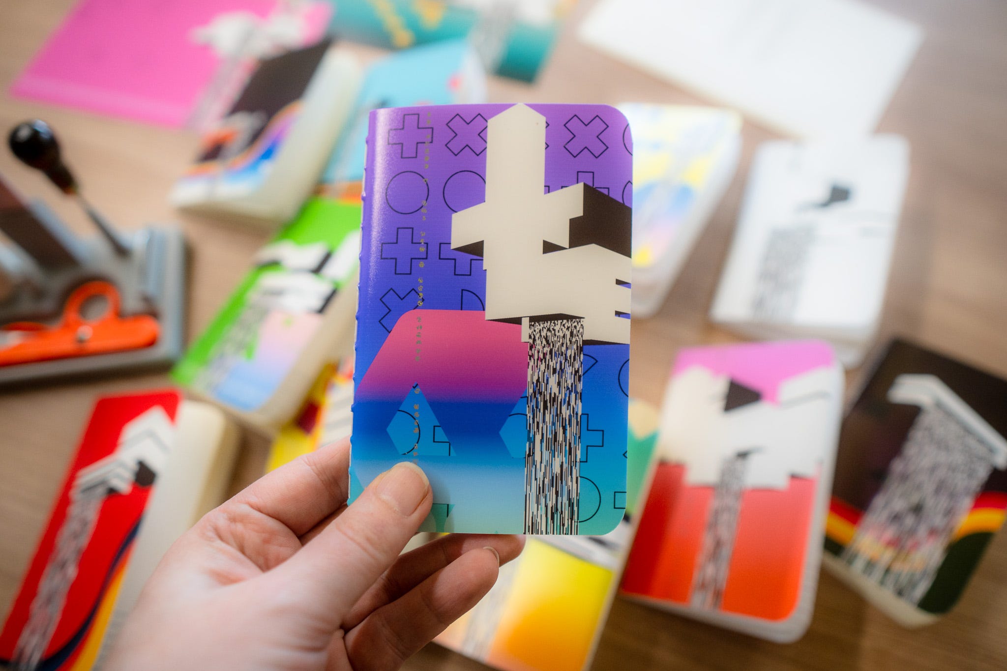
…it looks pretty good.
I know this is going to be a series of 32 generative notebooks, but beyond that I’m not quite sure what I’m going to do with them.
One of the reasons for making them though it to give myself something to do in the evenings that isn’t doom scrolling, and making stuff with your hands is nice.
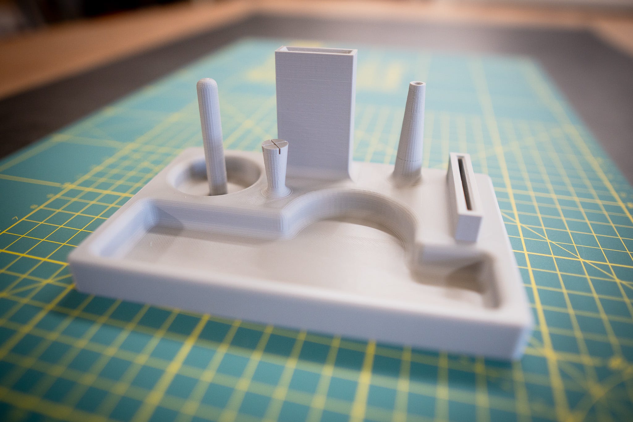
What’s been happening though is when I sit on the sofa folding pages, or stabbing holes, or sewing the whole thing, is I’m putting the equipment down on the arm of the sofa, or the seat next to me, or OMG WHERE’S THE NEEDLE, I CAN’T SEE IT, AM I SITTING ON IT? DON’T MOVE, WAIT, WFT.
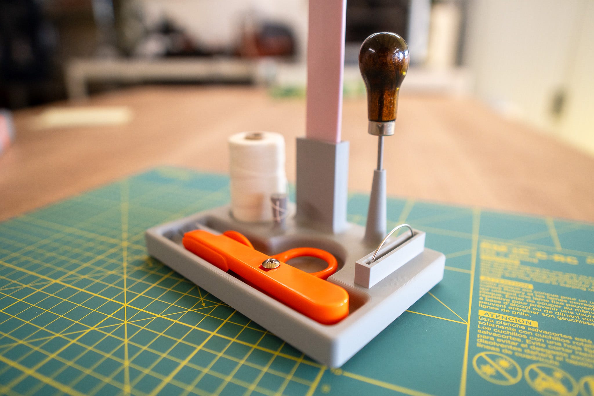
Which is why I now have this desk organiser to hold my bone folder, awl, snippy-snipper-thing, thread (with a handy nodule thing to wrap the end of the thread around and then hold tight) and most importantly a curved needle holder (the needle is curved, the holder isn’t).
The temptation to cast it in cement is pretty high (or pewter, or art stone), because I’m an idiot.
# MEANWHILE, NEW CODE ART
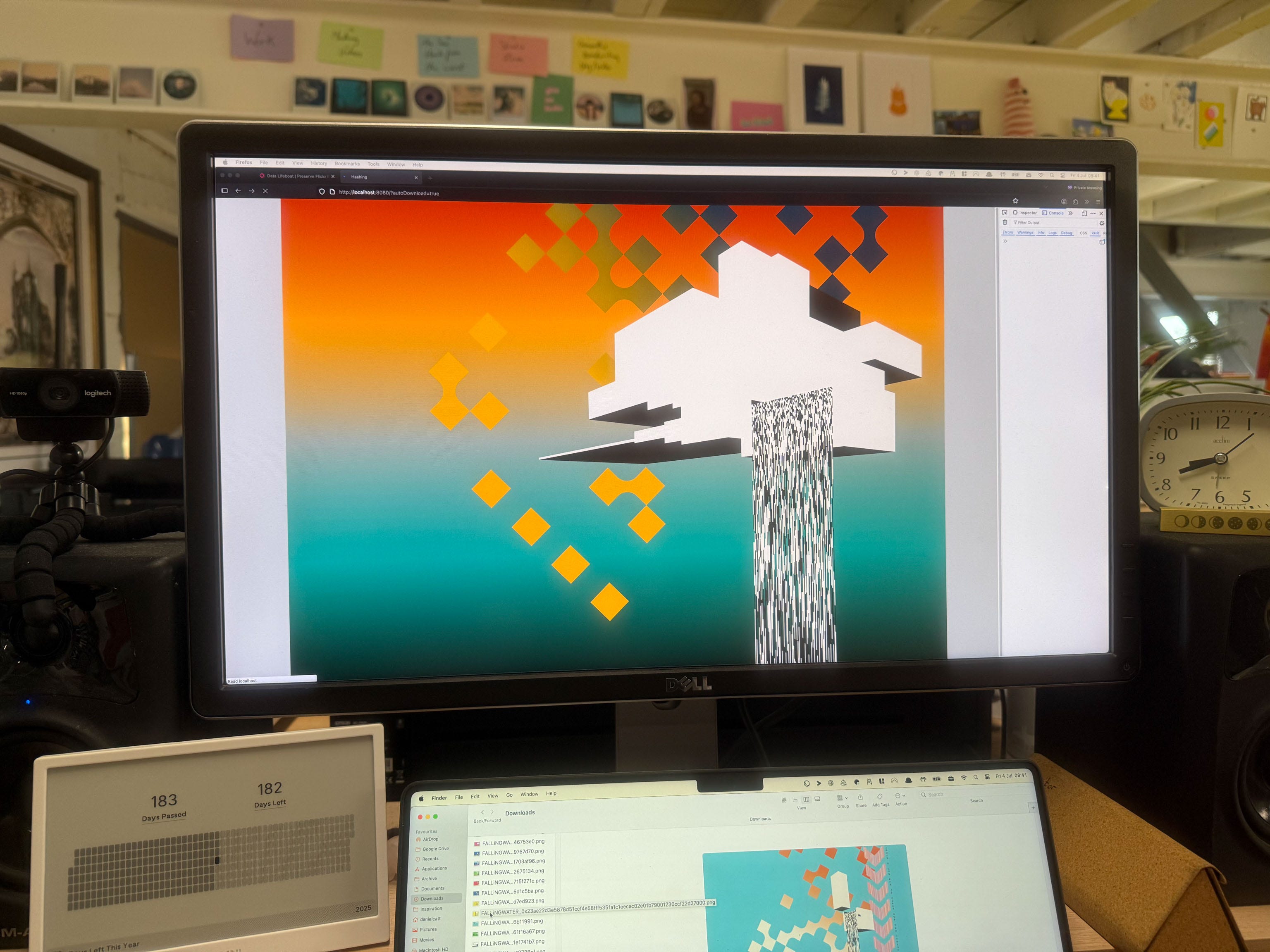
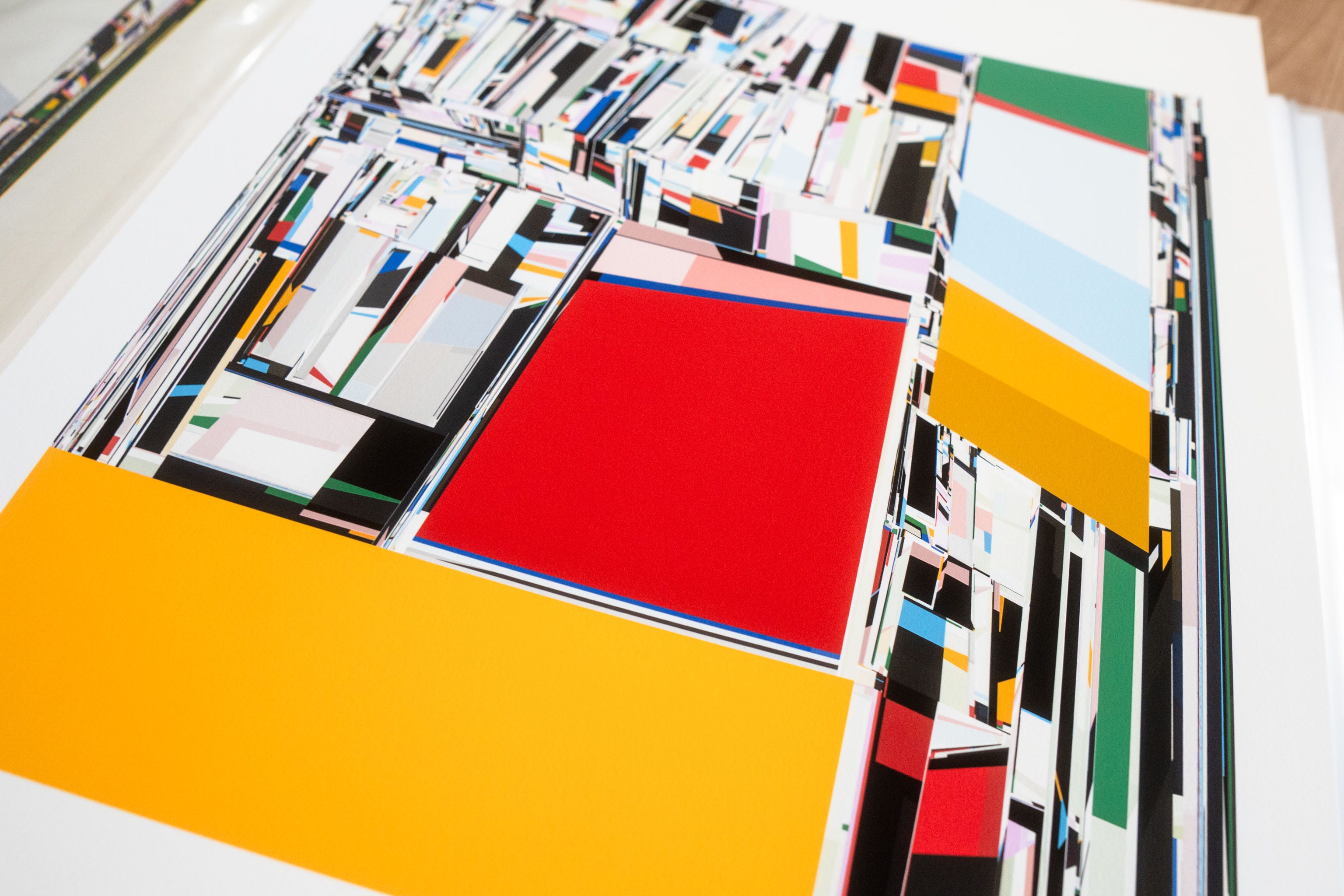
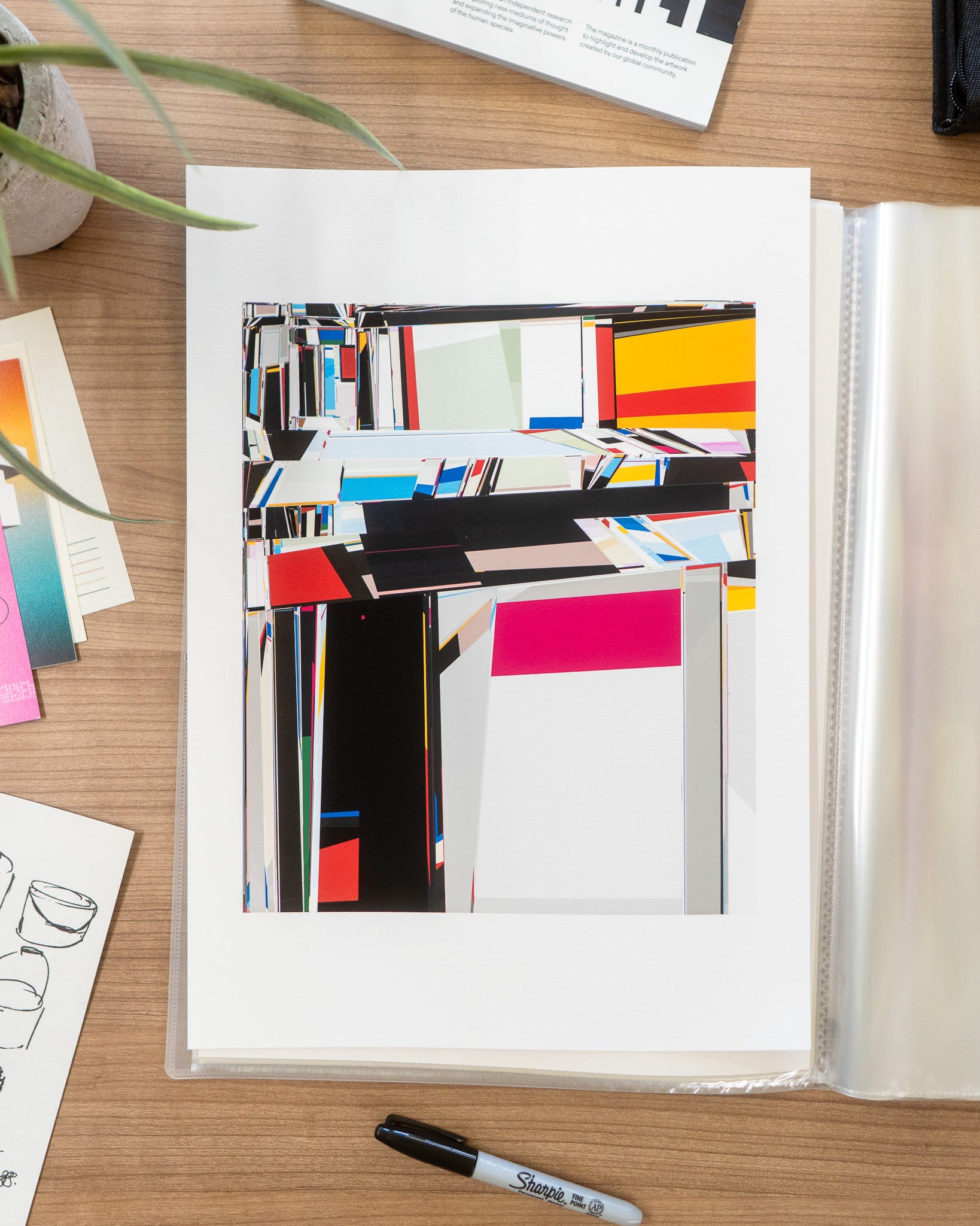
I’ve been working on a project for the new fxhash Open-form feature, a technical-ish artist focused overview here: https://docs.fxhash.xyz/fxh/programming-open-form-genart
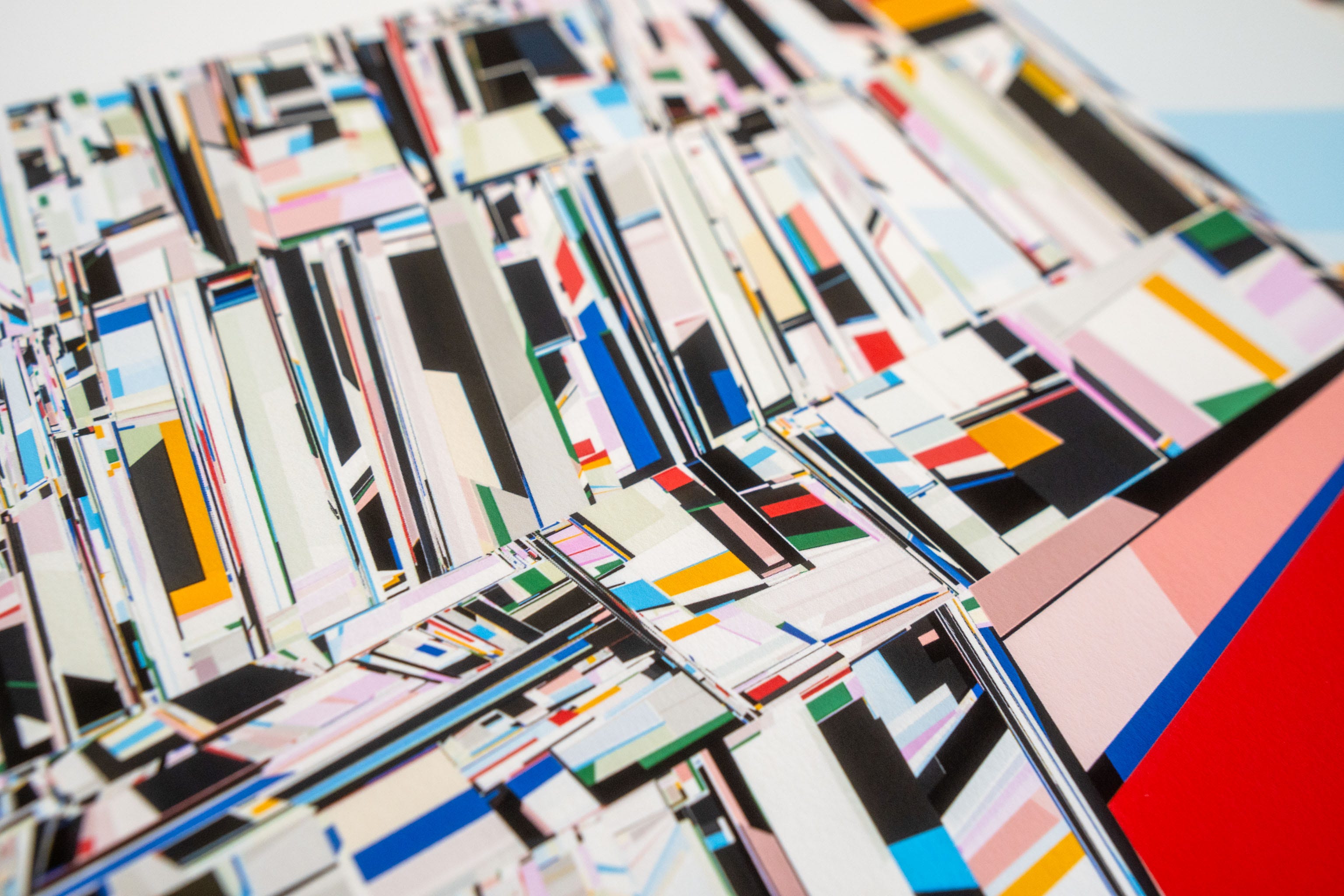
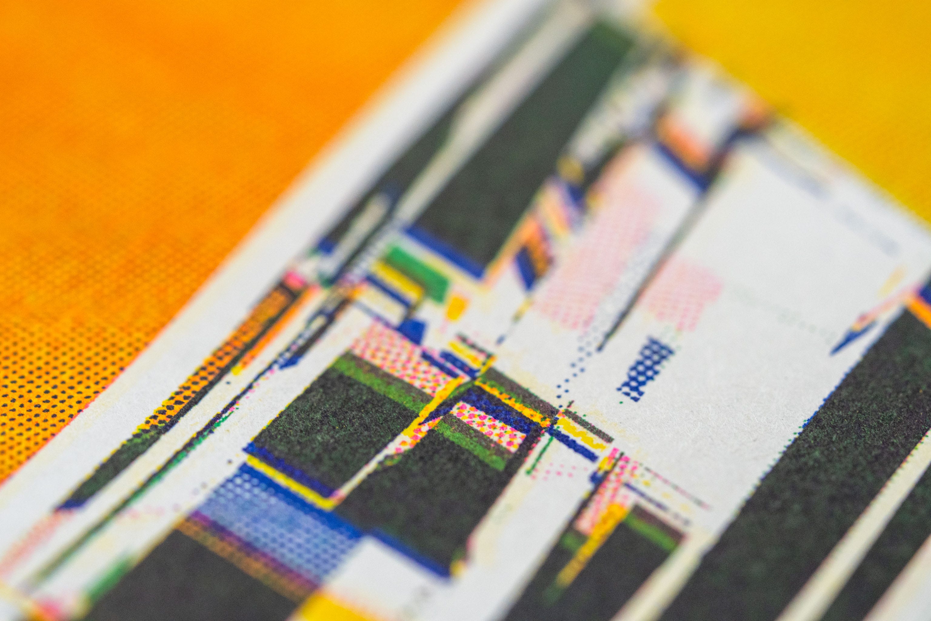
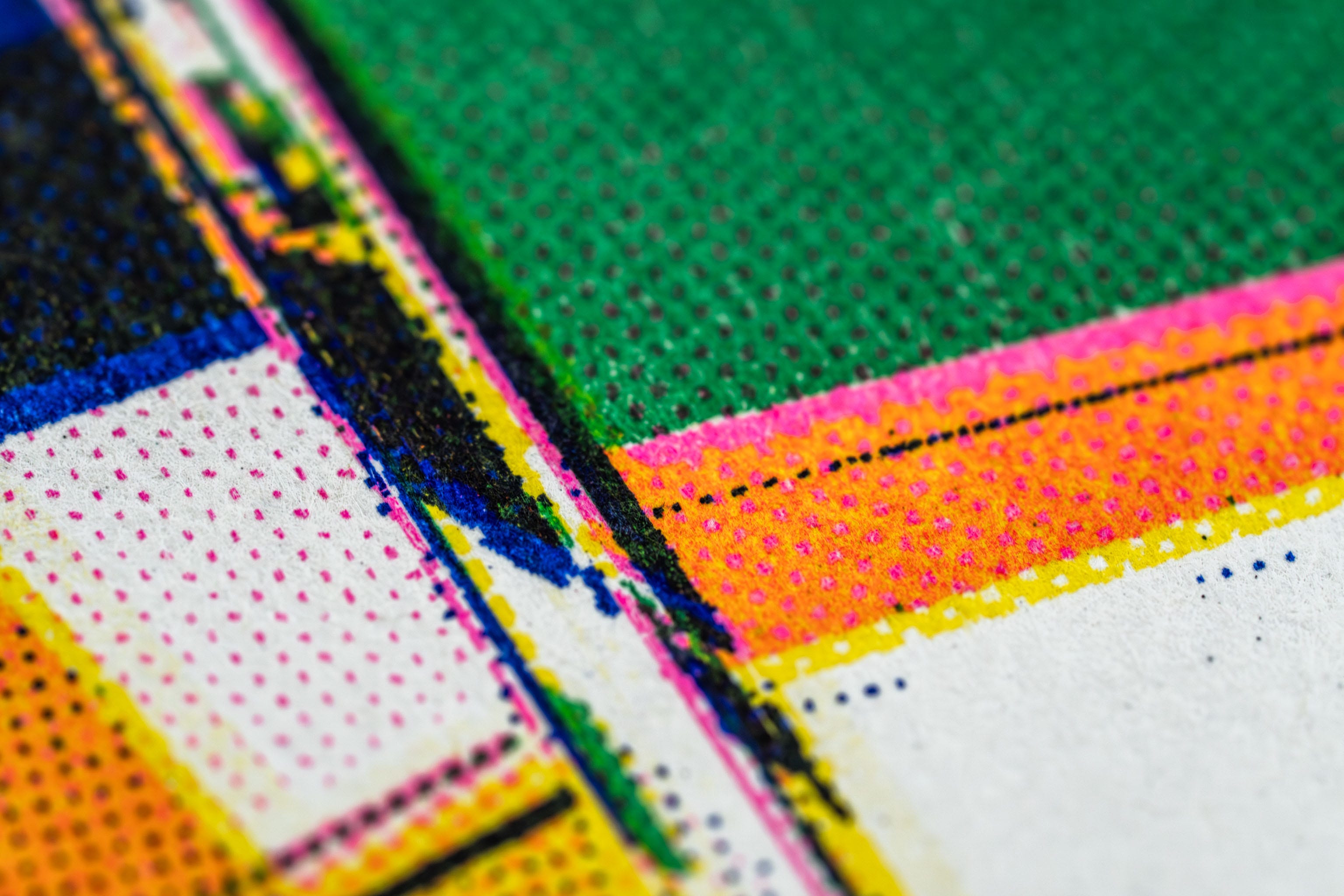
It’s still early days, and I’m sure I’ll write a much better overview soon. For the moment though here’s a test print (on the right), and a quick riso version (of course) on the left.
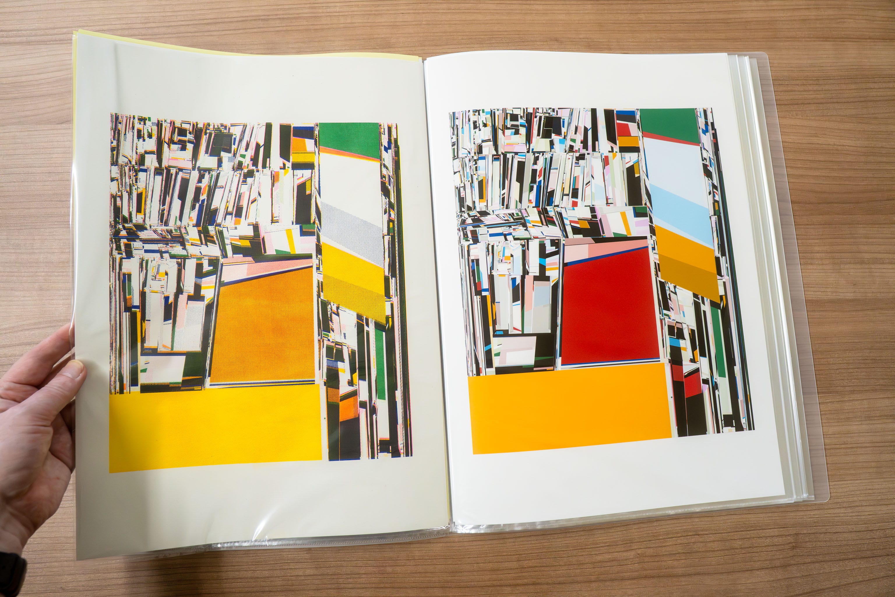
Printed onto archival paper…
…and some riso versions…
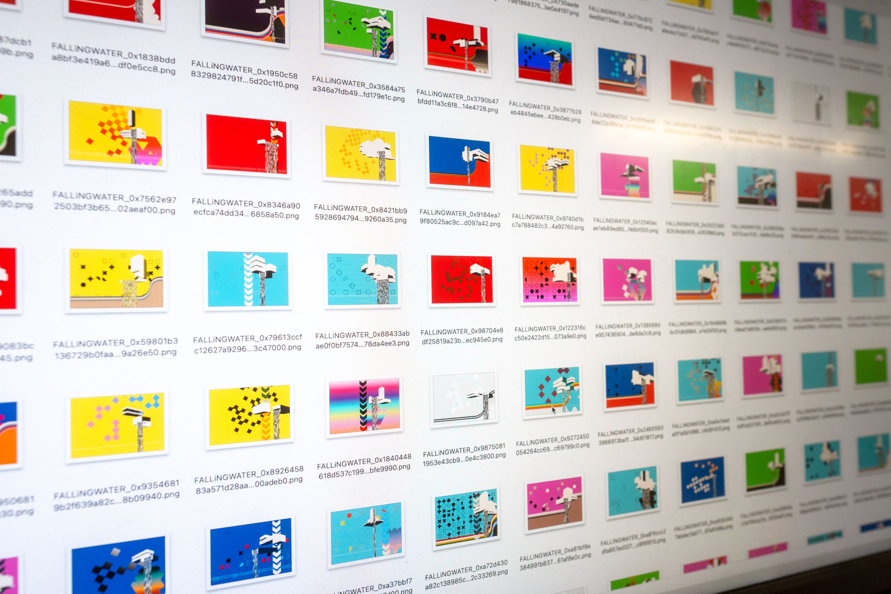
So, generally with code based generative art you write some algorithms that hopefully spit out a good result each and every time. The FALLiNGWATER project above is doing that, you run the code, you get an image.
Open-form is similar; you run the code, you get an image, but the idea is you can “evolve” that image which gives you the next “generation”.
There’s actually a huge throwback here to Richard Dawkin’s “The Blind Watchmaker” - see the PDF Evolution of Evolvability from 1988 and some Pascal code drawing “Biomorphs”.

In the Biomorphs program you’d start with something a bit rubbish, like a triangle (sorry triangles), and then 9 mutations would be created; by picking the one that looked most like a fly (for example) and then getting 9 mutations from that, you’d slowly “evolve” wings and so on, from one generation to the next, until, magically: fly!
There’s direct lineage to GANs and the current AI Generative Art here, fwiw; one image generation network makes some random pixels, and a separate image recognition system picks which one looks most like a fly (or the prompt it’s been given). The most fly like random assortment of pixels is used as the basis for the next generation, and so on, until after 1,000s of iterations the most fly like image as decided by the image recognition system “wins”.
Or alternatively the most shrimp like jesus picture gets posted to facebook.
🦐 🦐 🦐 🦐 🦐
There’s a couple of differences of course in that we’re going to try and NOT start with something a bit rubbish and spend 1,000s of iterations getting to the good stuff.
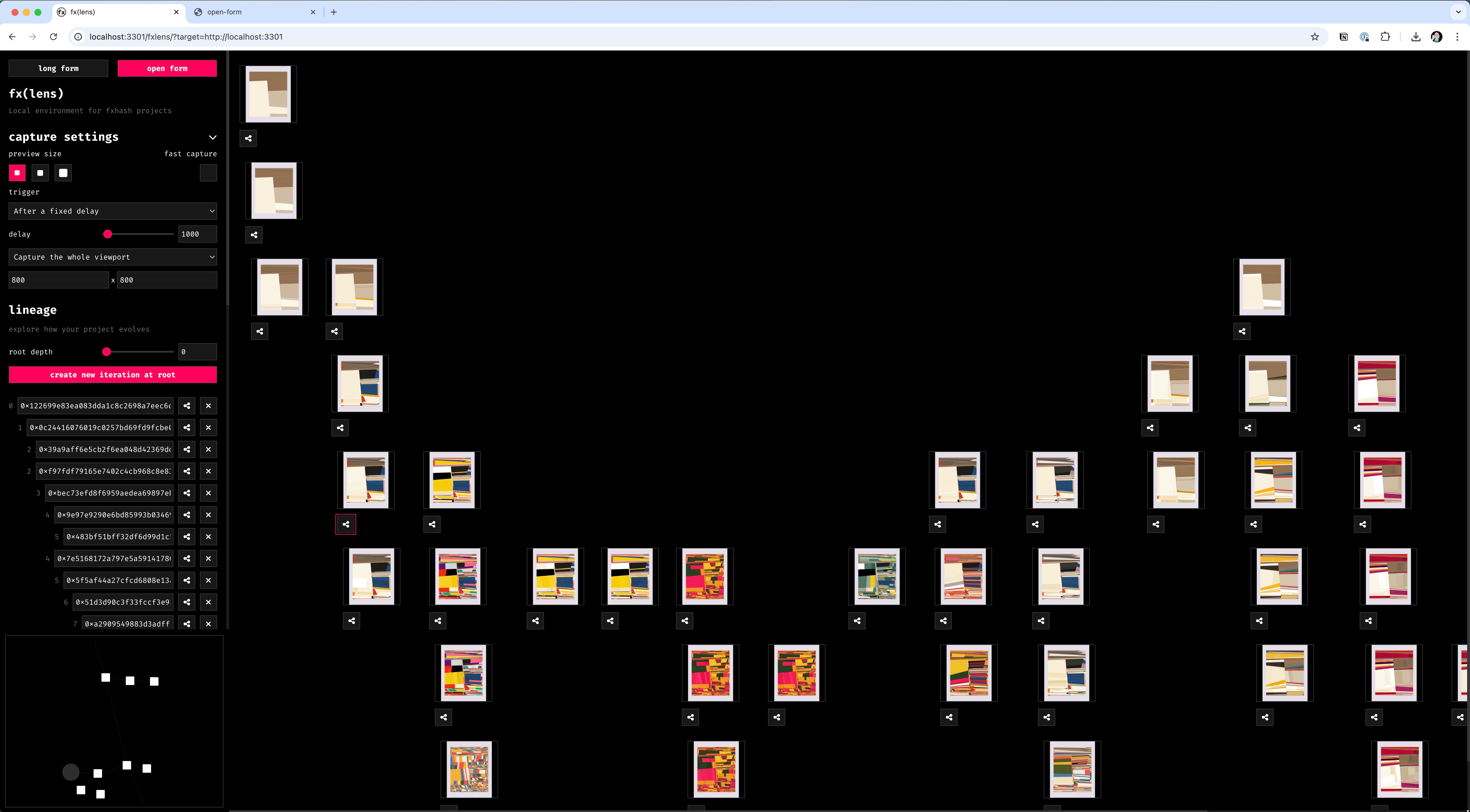
Here’s a screenshot of an early version of my own code, the top row is the first iteration, which evolves downwards (so we’re seeing 7 more generations going down the screen), adjacent images with nothing above them are siblings to the ones on the same row.
What’s shown above is a “simple” subdivision algorithm, but here are some basic principles I’m applying to the whole project.
First, premise:
It’s easy to make things start simple and get more complicated.
If you have “mutations” than can introduce new features or design, they’ll tend to happen in later generations.
It’s tempting to keep “desirable” features for later generations.
If, for example, we have a monochrome palette (which everyone loves) and that only shows up later, you’ll end up with monochrome palettes only showing up on later more complicated designs.
And as it happens I like some of the earlier more simple subdivisions, so in my code, I’ve…
Taken on my design methodology of keep pushing things to be complex and then rip things out to simplify it again, a sort of six-steps forwards, four-steps back approach I apply to nearly all my work/projects/art/life. In this case the deeper you go into iterations, the greater the chance of the code reaching back to previous generations and grabbing simpler/larger design elements, or sometimes resetting the whole thing. So you can get earlier layouts along with the later features.
Add early but volatile “mutations” giving access to later generation stuff, but it dies off in a couple of generations. I have some drawing styles that tend to kick in later, but there’s a chance for them to appear super early (and so again mixing with earlier features and simple design), but they don’t stick around. Unlike the more permeant version that can appear later.
Pretty much these two things mean that there’s a good amount of design space for people that want to dig deeper, but you don’t have to, it’s entirely possible to access features sooner (through luck or “re-rolling”), but they don’t stick around.
The idea is to reward people for exploring deeper, while not penalising those who want to quickly dip in & out (while also not taking away from the people who explore deeper).
I swear it makes sense!
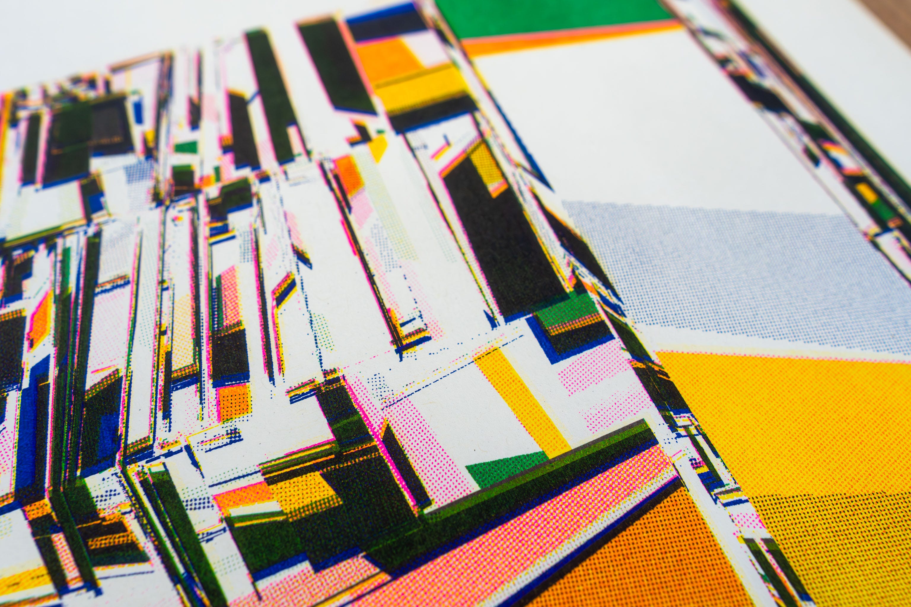
Here’s another test print where you can see the complexity of the subdivisions, but it’s pulled in some of the simpler shapes from early iterations.
A lot of this is because I must confess to liking some of the very simple starting points, that mostly look like this…

…which turn into…

Anyway, it’s still early days, and there’s more I want to add (but not that much more), so I’ll throw in another gratuitous riso print version 😁
#🔺 🟡 🟦
I’m now going to try and tie the two above projects together; the design of the sewing tools holder and the code-art project, by dropping in this Bauhaus 100 documentary, in an attempt to appear cleverer than I actually am (not hard).
# THE END 🔥
🔥 🔥🔥🔥🔥 🔥🔥🔥 🔥 🔥🔥🔥 🔥 🔥🔥🔥🔥🔥 🔥🔥 🔥🔥🔥 🔥🔥 🔥 🔥🔥🔥🔥 🔥🔥 🔥🔥🔥🔥🔥 🔥 🔥🔥🔥🔥 🔥🔥🔥🔥 🔥🔥🔥 🔥 🔥🔥🔥 🔥 🔥🔥🔥🔥🔥 🔥🔥 🔥🔥🔥 🔥🔥 🔥 🔥🔥🔥🔥 🔥🔥 🔥🔥🔥🔥🔥 🔥 🔥🔥🔥🔥 🔥🔥🔥🔥 🔥🔥🔥 🔥 🔥🔥🔥 🔥 🔥🔥🔥🔥🔥 🔥🔥 🔥🔥🔥 🔥🔥 🔥 🔥🔥🔥🔥 🔥🔥 🔥🔥🔥🔥🔥 🔥 🔥🔥🔥 🫠
Love you all,
Dan
❤️
PS. People with exceptionally good taste in videos that are 37 minutes and 49 seconds long seemed to enjoy last week’s #Weeknotes
I am in love with your tool holder. I use a cigar box to hold my bookbinding thread and my lo-tech hack was to affix a magnet on the inside lid to keep my needle handy. But your tool docking space station is so much cooler!