

🎃 #047 - No such thing as too much yellow
Also some stuff about pen plotting

Putting the studio news right up top this time, and this is the last time we’ll have to talk about it. Or at least until the inevitable happens and I have to move out of this “new studio” (henceforth to just be known as “the studio”), but at least I’m renting this time.
Also, whoever eventually moves in next will have this to deal with…
The studio sale/exchange/completion thing happened the day after the last newsletter, that chapter is now closed, yay! I spent last week trying to adjust to this new reality of not being stressed all the time, and also a whole heap of post sale admin that involved a lot of banking.
I’m feeling particularly uncomfortably decadent & self-indulgent by spending money and buying ALL THE THINGS. But to be fair a lot of that is to replace stuff that’s either broken or run out over the last couple of years, it just feels super weird to do it all in one go.
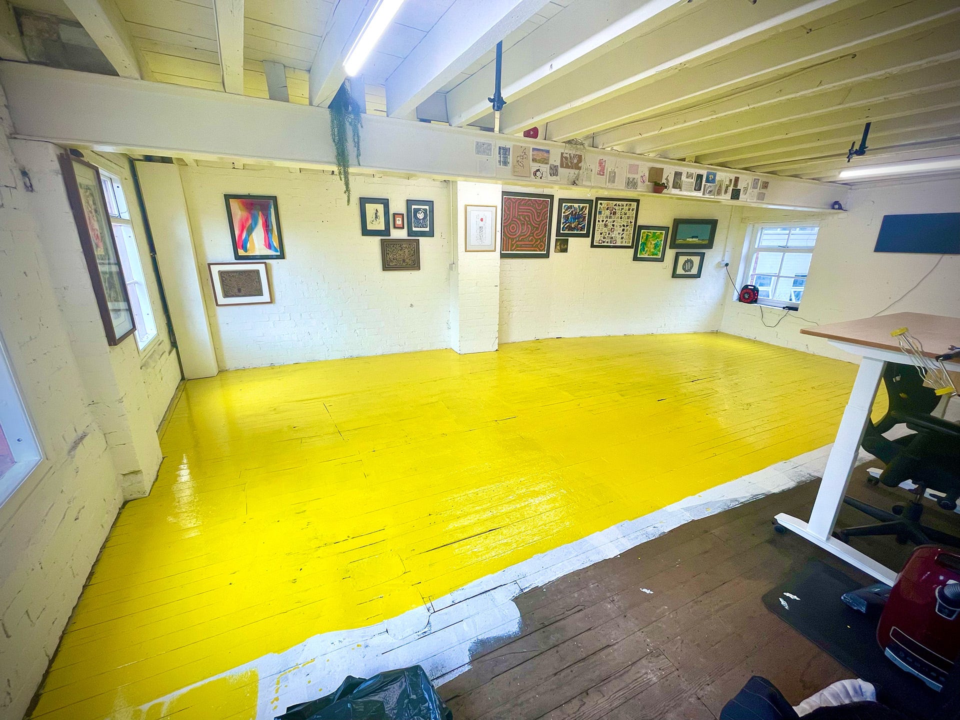
The rest of the money has gone right back into savings, apart from the bit that got exchanged with Dulux for this “rather bold” yellow floor paint (and a watch, more on that another day).
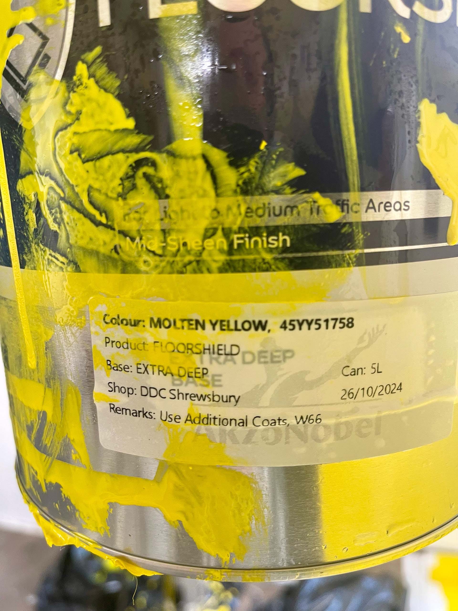
They’re not joking when they say “Use Additional Coats”, although I’m going to stick with just three.
# MOLTEN YELLOW
My top artist’s tip, if you care about showing your art in its true colours in photos or videos is DO NOT PAINT THE FLOOR OF YOUR STUDIO YELLOW!
I absolutely cannot stress this enough.
My white walls, now glow yellow.
White ceiling, yellow glow.
Any light that bounces anywhere? Those photons are yellow as fuck now.
Any bright prints I have up in the studio now look dull in comparison, and any neutral prints look bluer as your eyes deal with all the yellow.
The iPhone’s “computational photography” process is freaking the fuck out trying to may everything look “normal”, and goodness knows how I’m going to white balance the video for this week’s #weeknotes.
But, despite all of that, and even though only one half of the floor is done so far, it makes me smile, so very much every time I walk into the studio, that it’s totally worth it.
I, am, beaming with delight, very yellow beaming and very yellow delight.
# Actual Plotter Art
I’ve had the chance to work on and update the “70s Pop” pen plot design over couple of months. I’m gunna see if I can do this in the format of pictures with a little text between each one. Either this will work well, or the formatting will be horrid, I guess we’ll find out.
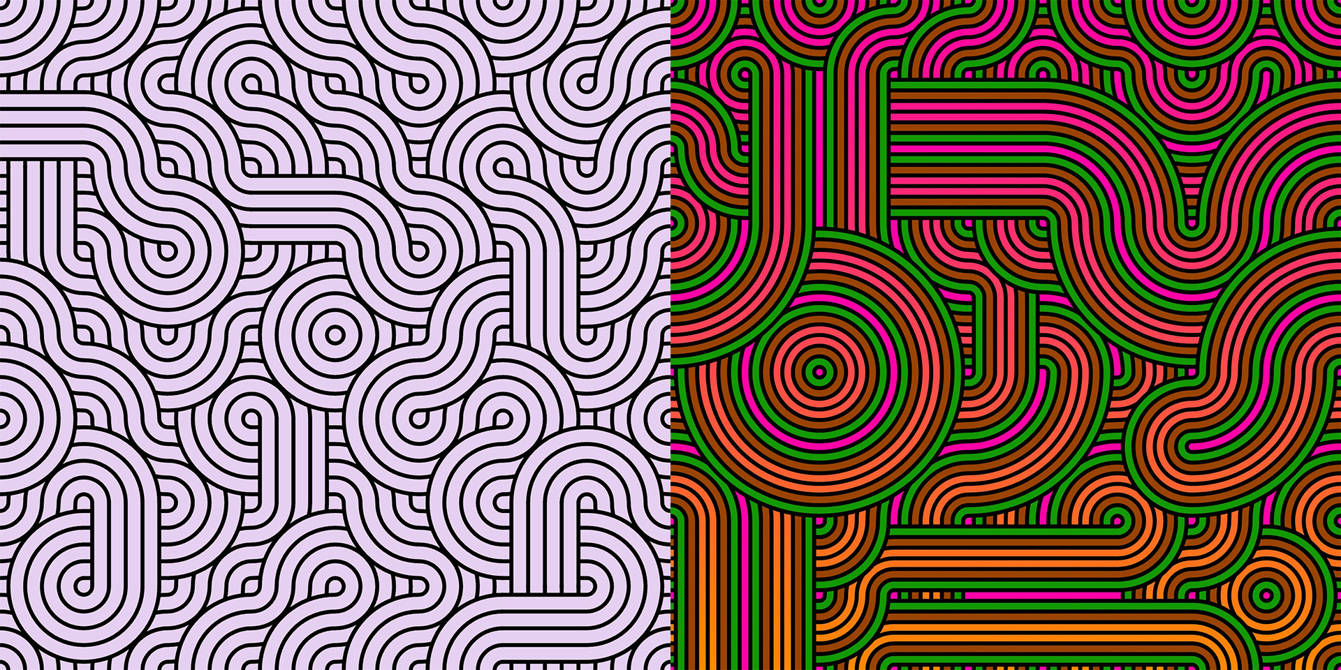
“70s Pop” is an ongoing art project hosted on ArtBlocks.io; shown below is an image from Series One (on the left) and Series Two (on the right, duh).
Which was itself based on a pen plot design I was working on.
The joy of this design is it’s a truchet tile, which without going into too much detail is basically a tile, or set of tiles that can be rotated and placed next to each other and will always just-work, often building designs that look far more complex than the tile used to build them.
The design on the left is made from two tiles, a “curved” tile and a “straight” tile. The design on the right is the same but also “multi-scale”, in that there are larger and smaller tiles, that still magically just-work, due to a little bit of trickery.
Steve has a good video about the topic:
However for pen plotting I’ve only every done the first type, where all the tiles are the same size, so the first job was to create a way of making tiles of different sizes. There’s two ways of doing this.
The first is to start with some large tiles, and then randomly decide if you want to split one of those up into four smaller ones, a process you repeat with those smaller ones and so on, down however many levels you want. It looks a bit like this…

…also known as recursive subdivision, which is great and can be used for all sorts of things.
Another way of doing it is in the opposite direction, you start with lots of the small squares and then, in a loop, randomly pick one and attempt to merge it with the ones to the right, below and below-right, turning a 2x2 grid into a single larger square. Until you either hit the limit of however many you want, or you’ve failed to hit on a valid 2x2 mergable grid a number of times. A bit like playing battleships.
Then you do the same again, randomly picking a small square and attempting to merge a 4x4 grid of 16 squares into a larger one…

…you can fiddle around with the rules a little bit, like trying to make a large 8x8 merge(s) first, then 4x4 and finally 2x2, or some other order that makes more sense. Of course they needn’t be squares you could try 2x3, 3x2, 2x4 merges and so on.
Neither is better, just different, although obviously the second one is better 😁
So, just to recap, because it’s going look a lot more complicated in just a moment, below is how the previous 70s Pop pen plots were working.
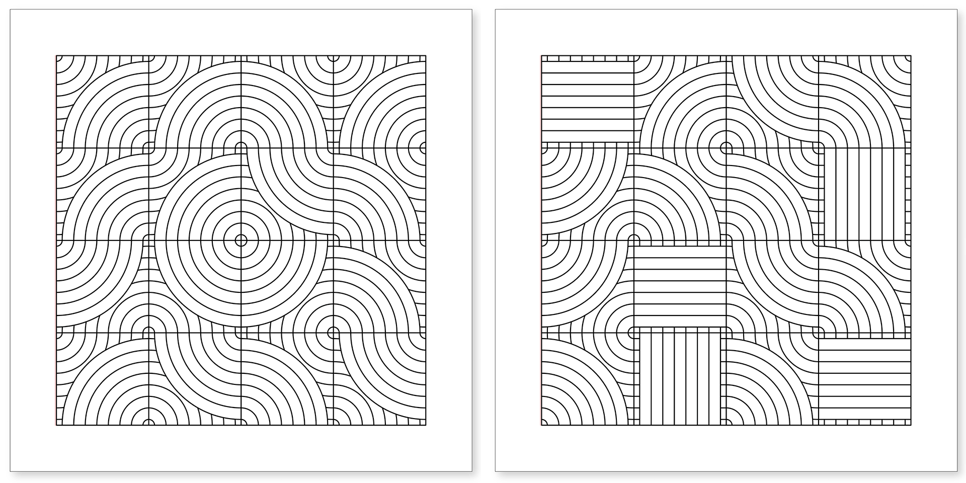
The left side is just the one tile type “curves”, the right has a second tile type imaginatively called “straights”.
Throwing those tile designs into the “merged” squares, and using a number of lines per tile that’s conveniently divisible by 2, we build up our “multi-scale Truchet tile”.
With and without the tile outlines (these are two different designs, btw).

I personally think, that given just the image on the right, and not having having seen all the steps above, someone would have trouble spotting the design was made from just two “tiles”.
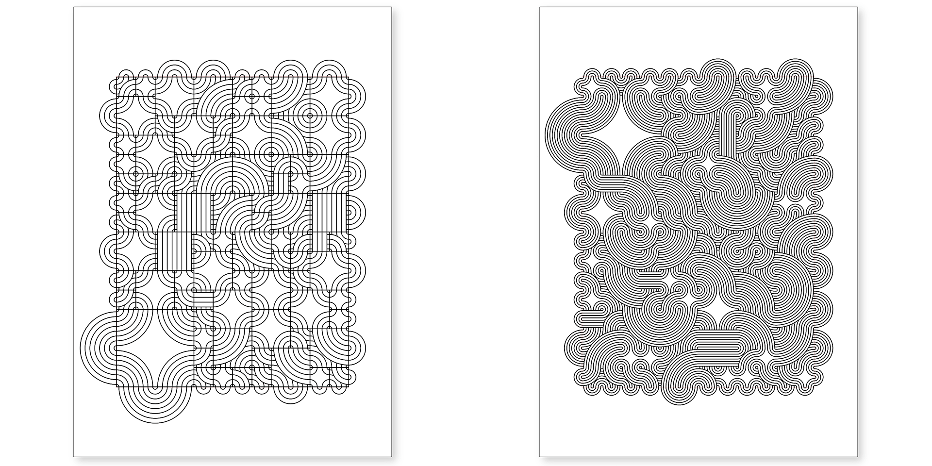
Here’s two more where we’ve doubled the number of lines used each time.

Which starts to give us design like this…

The other thing I wanted to add to the pen plots was neatening up the edges. On the ArtBlock designs, they were created so you could tile the outputs together, to make wallpapers and such like. The left side would seamlessly connect to the right and so on.
And while that’s also true on the designs above, it makes less sense on a physical plot (until we start plotting cube nets, next on the list), as you’re not going to get several of them all connecting side by side.
So now we make the lines of each edge tile connect back to itself. Again we could mess around with this a bit to make them connect differently, but I was happy with where this was for the moment.

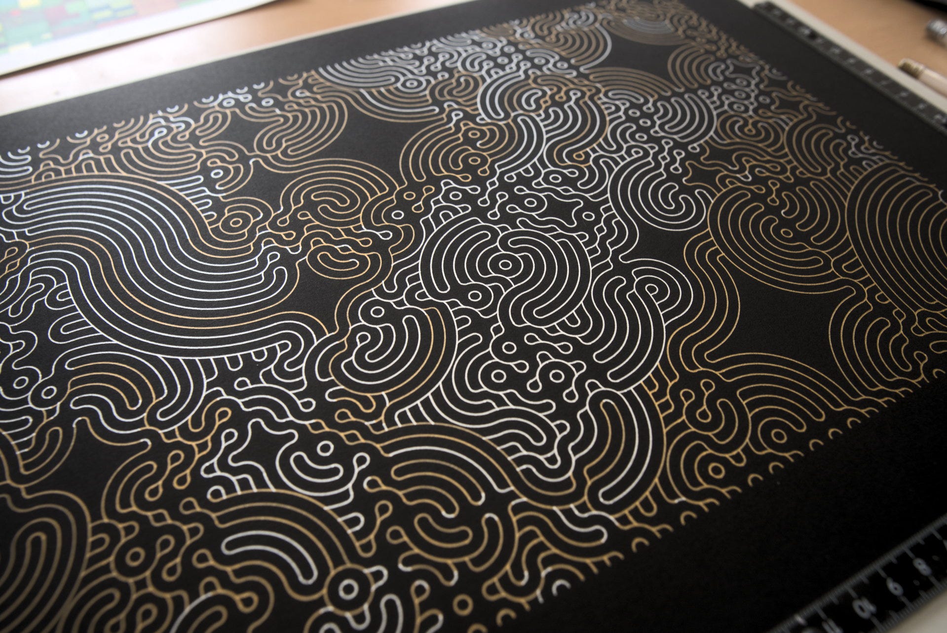
The final thing, for the moment, which you can see in the design above, and the screen shots below was to randomly “delete” tiles. The tiles surrounding the deleted spaces are joined up by adding curves in each corner of the empty tile.
You may have spotted there’s a bit more going on in the pen plots because they’re using gold and silver ink in the design. But Substack is telling me I can’t include any more photos or else email clients will start to cry, so I’m going to have to leave the explanation for that one until the next newsletter.
Once I’ve gotten to the end of it all I’ll upload the webpage tool thingy I’m using to do this to my website, so anyone can get to play.
# THE END
It feels good to get back into the swing of talking about pen plots a bit more. Now the whole studio saga is over I feel a bit more able to allocate time to making videos, blog posts and of course have stuff to talk about in these newsletters, phew!
Substack is telling me to pack it in now, so, I’ll see you here again on the 14th of November!
Love you all
Dan
❤️
Congratulations on settling the studio! I’m really happy to see some PLOTTING content as well. Was getting lost in the weeds for a bit.. keep up to good work. Also yellow floor looks like a nightmare!! I would have to wear sunglasses inside, so not sure how you make it work.. lol each to their own I guess.